The email marketing landing page welcomes new visitors directed from advertising emails to the website by attracting and providing solutions to their problems. It represents the website with design and branding.
Let’s assume your motor car is having a problem. You participated in an automobile business survey online, providing your email to learn about the solution. A day after, you get an email with a call-to-action (CTA) that meets your needs. Ideally, that can make you click on the link. The link will drive you to a page containing brief content based on your situation.
That page might contain freemiums or purchase options of useful features synchronizing your needs and will exclude every distraction that defocuses your problem. The visualization of that page represents the perception of the website also.
This page is an email marketing landing page trying to influence visitors into being buyers.
What is Email Marketing Landing Page?
An email marketing landing page, also called an email post-click landing page, is a standalone page on your website. It gives access to your targeted audiences to land on your website by clicking the link you placed in your marketing email. This page contains details of a particular offer or action with visualization elements like images, videos, fonts, CTA, simple purchase options, etc.
There are various kinds of landing pages. If you create a landing page to generate leads, it becomes a lead capture landing page. When a landing page represents encouragement with freemiums, then it is a click-through landing page. Similarly, a landing page directed from the link in an advertising email is an email marketing landing page.
48% of online business platforms create landing pages for each campaign following “one offer, one landing page” rules.
So, it would help if you run an email marketing campaign to direct targeted audiences to your email marketing landing page. This campaign requires leads to where you will send emails. Here are some tips on how to get leads for email marketing.
The Aim of the Email Landing Page
The ultimate goal of your email landing page is to move the visitors down to your sales funnel in stages. A landing page directed from a marketing email is an excellent opportunity to convert visitors into buyers when they move through your sales funnel. The stronger your landing page is, the more probability of getting new paying customers in your business. The main focuses of an email marketing landing page are –
- Welcoming targeted visitors
- Introducing your business based on their problems and attributes
- Increasing new interests by educating with brief content
- Preparing them to get the following marketing email
- Avoiding the distractions (such as providing links on the email marketing content not matching with the CTA)
- Making them focus on particular items
- Manipulating visitors to put those items on the cart and encourage them to come back with an abandoned cart email if they left the cart
- Inspiring them to make a purchase
- Offering the paying customers another item based on their attributes
An email post-click landing page influences your business to build long-term relationships with subscribers and customers, making their mindset trust you. In the context of companies online, consumers’ trust is the major part that matters.
Email Marketing Landing Page Optimization
As an online marketer, you must have expectations when sending promotional emails. You’d like for your recipients to take specific actions. There are strategies for you to maintain, as it is not an easy task to make them do whatever you designed.
Required Elements
An email post-click landing page needs some elements for better output. These elements are the connectors between your business and the visitors.
1A Catchy Headline
The first impression is crucial when communicating. A catchy headline is something like that. Like your advertising email, the landing page also needs a headline that catches your recipients’ eyes and minds.
An email marketing landing page always appears after clicking the link in marketing emails. The people on your email marketing landing page are aware of the design of the headline you used in your email content. It will confuse your visitors if they find a different format from the email content.
That’s why you need to put an eye-catchy headline with an attractive font style based on customers’ keenness or eagerness, matching the headline you used in email marketing.
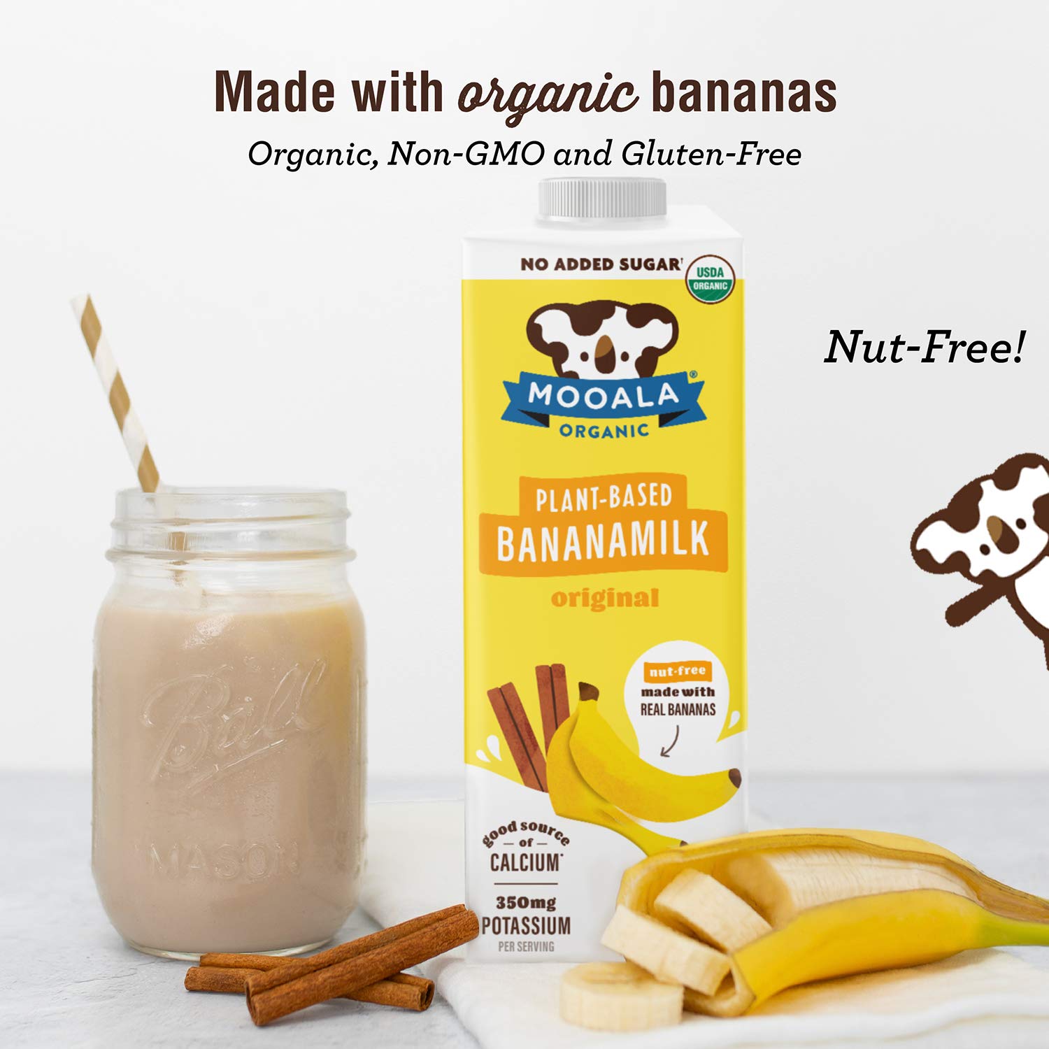
This headline might immediately catch the eyes of those who love organic food, especially bananas!
2Testimonials Using Social Proof
Social proof is a socio-psychological phenomenon that indicates peoples’ tendency to copy others’ actions or attributes. When you go to new surroundings, you try to define the correct behavior by noticing the people around you. This scenario is not different when you are online.
Most online businesses work hard to collect the customers’ opinions in the comment section because new visitors tend to follow the reviews. On the other hand, customers love it when the brand talks to them about the customers’ needs or their needs. When a new user finds all the opinions of experiencing from the previous customer about the chosen product in the same place, it is a customer testimonial.
Testimonials use social proof to engage customers with your website, making them return.
88% of online customers will trust you after watching customers’ reviews that represent their experiences on particular products or services, according to Search Engine Land.
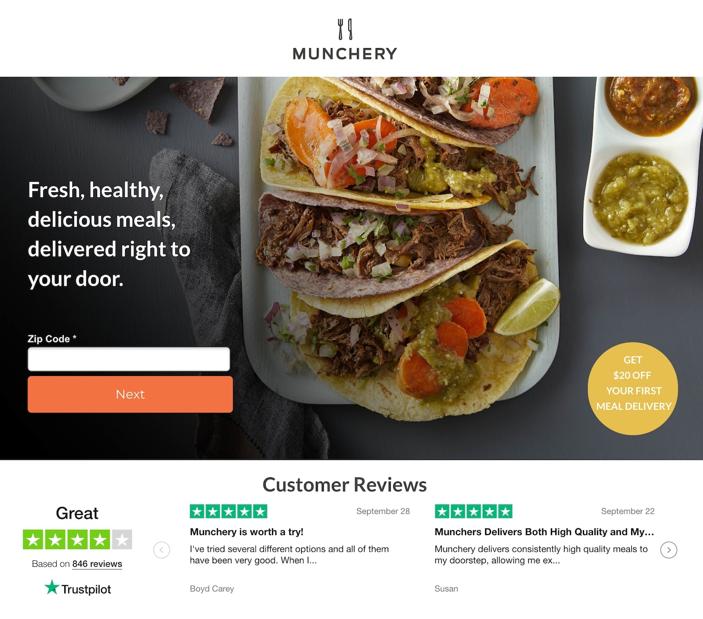
An email landing page from Munchery has excellent values as it reflects the experiences of existing customers, which might help new prospects to keep faith in you.
3Compact Bullet Points
Bullet points will help you concise your landing page content. It needs to explain or offer whatever you want to do in summary on the email post-click landing page. Your visitors won’t show interest if the content size is more extensive and exaggerated.
Using bullet points is a great idea, maintaining consistency, starting each with a verb. Besides giving pieces of information, you need to share feelings to engage people emotionally.
It makes sentences harder when you implement prepositional phrases. “The thoughts of Russel are good” seems more complex and prolonged. On the other hand, “Russel’s thoughts are good” looks shorter and easy to read.
4A Sign-up Form
Building an online community to expand your online business is an excellent thought. A sign-up form or opt-in form refers to people who join your network. This type of form contains some placeholders to fill with information.
Suppose you have a tourism business that needs to run a statistics campaign to know the attributes of the people of the selected geographical area. You might need data about your targeted audience’s food choices, living comforts, and other behaviors so that you can offer what they need in the future.
But, be careful with questioning personal information, as people are more sensitive today. The conversion rate of the email marketing landing page might drop if you put a sign-up form there. Many people have sensitivity to their age as they tend to hide it. That’s why demography is essential.
A study shows that landing pages not asking about age have 40% higher conversion rates.
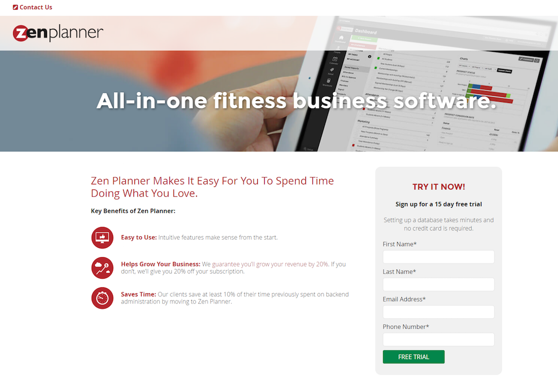
Here is an example of a fitness app Zen Players’ landing page. It offers a sign-up form to those who are concerned with their health.
5A Shopping Cart
9 out of 10 users research the products or services they want, and the other 1 person doesn’t like it this way, according to a study.
They want it desperately, without checking any testimonials containing social proof or blogs. Putting a shopping cart on your landing page will be helpful to them.
It will help your business to increase sales directly from the landing page. The similarity and simplicity of the marketing email content and the landing page can immediately gain customers’ trust.
The ultimate aim of any business is undoubtedly to increase sales. That’s why you need to give them chances to purchase whenever they want.
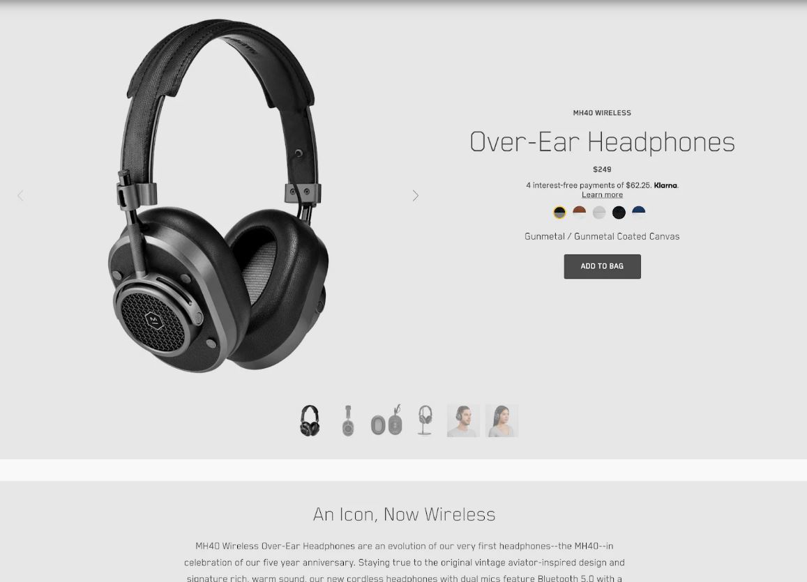
The example given below contains a quick shopping cart that will allow people who want to purchase immediately.
6One CTA
It is essential to make the visitors focus on one specific action through your email marketing landing page. You might feel the urgency to add more than one link to your landing page to get traffic to particular pages or make the subscribers take more than one action. But, it’s not the time for that temptation.
Email marketing landing pages are about to focus on one specific step, while others seem to be distractors to it. If your landing page is about to offer a hotel room for rent, offering a car rental service on the same page will distract the primary intention.
Multiple offerings can lower the conversion rate by 266%, according to BLULEADZ.
So, you should put one CTA (call-to-action) to focus your customers on taking a particular action. A personalized CTA will show you the best result.
As per HubSpot, a more engaged and personalized CTA can increase your conversion rate by 202%.
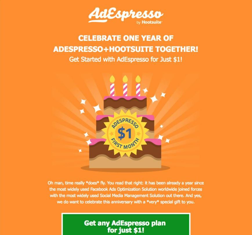
An example of a landing page from AdExpresso shows how to engage a single CTA with no distraction.
7Matching Visualizations
Repetition of visualization can help you brand your corporation. Using the colors, fonts, and overall visualization in your email marketing landing page matching with email content is repetition.
If you offer 40% off on a particular product in your marketing email, the headline, texts, images or videos on the landing page should represent the same offer. If you engage all these elements based on your selected message, it will automatically empower the CTA. Marketers create email marketing landing pages for their customers to focus on a particular action. Matching visualization helps them to do it psychologically.
A video explanation on your email landing page would be the best option. Some businesses even incorporate visuals made with an AI avatar generator to deliver a consistent, branded message without needing to film real actors.
A video can boost your conversion rate by 86%, followed by a study.
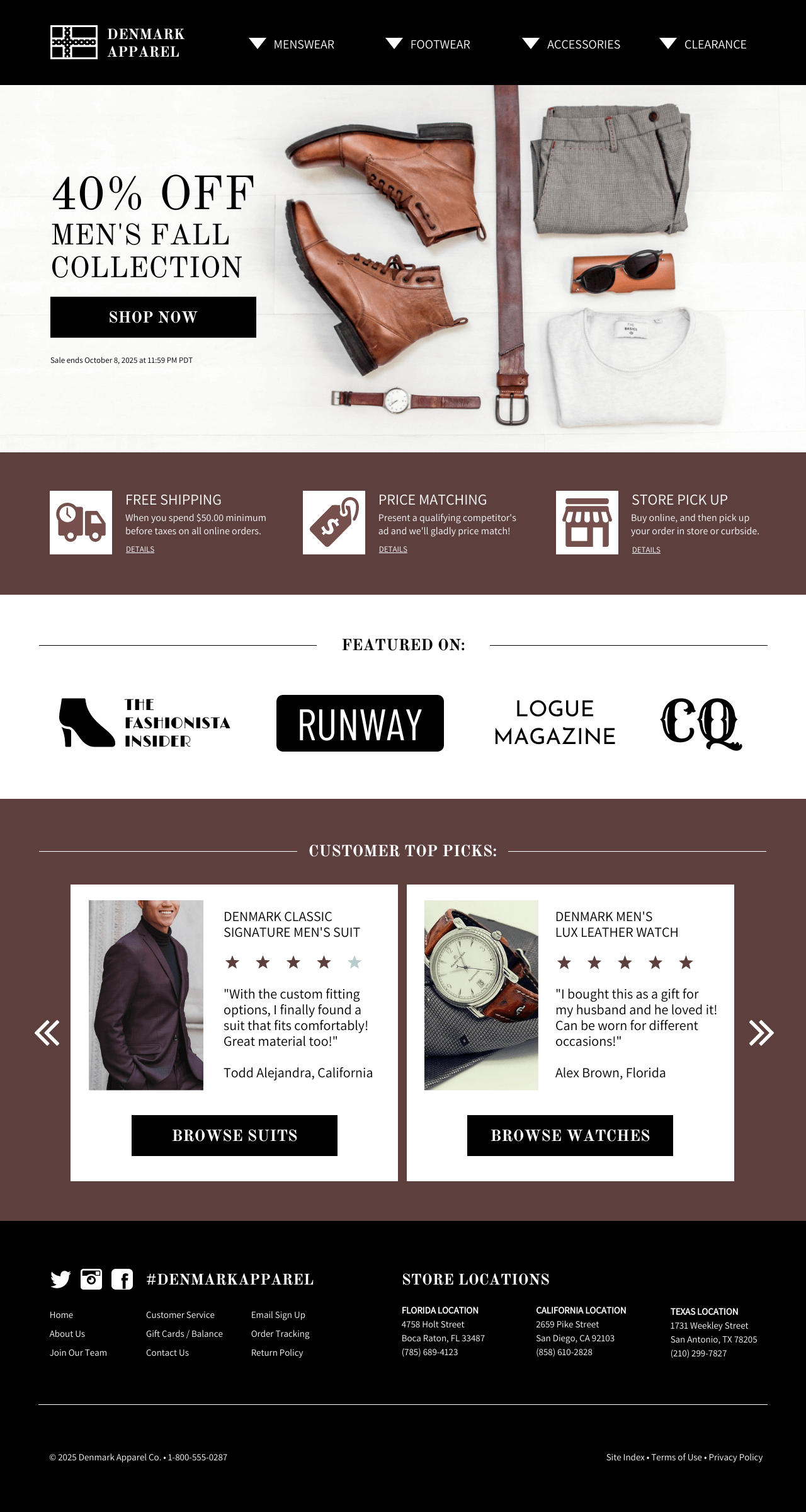
Here is an example of an email landing page from Denmark Apparel. It contains a catchy headline, testimonials, a quick shopping cart, an engaged CTA, and the fear of missing out, making this page outstanding.
Affecting Factors
Some catalysts affect your email marketing landing page. After creating a landing page for post-click email marketing and maintaining the abovementioned things, you should focus on these catalysts.
1FOMO
FOMO (Fear of Missing Out) is a feeling you can push into your customers’ minds. Users don’t want to miss an opportunity when it synchronizes their needs and abilities. Just so you know, offers are limited, in general, in the context of timeframe.
For example, many marketers use “50% off for limited sales” as headlines. If you send a tourism offer to a person looking for the best place for leisure with FOMO, it will most likely put interest in them. They will feel tensed about missing out on the chance to save money as they are not sure to get this offer again.
2A/B Testing or Split Testing
A/B testing will improve the performance of your email landing page. After creating this page, you need to check it practically using A/B testing or Split testing.
This process allows you to check the performance of every element you placed on your landing page. You can rearrange the stuff if it gives output less than your expectations. It would be best to try several tests to ensure the best result.
According to a study, split testing can lead you to increase sales by up to 300%.
3Page Loading Speed
Website Builder Expert shows that pages with 2 second loading time have a 9% bounce rate, while 5 second loading time results in more than 38%.
So, loading time matters—every second of delay while loading is countable with lost conversions.
PORTENT says that each additional loading time causes a 4.42% fall in the conversion rate.
You can optimize your landing page’s loading speed by improving it properly. Too many uses of high-resolution images can slow your landing page. Keeping your email landing page minimal and on point are the best way to get the fastest loading speed.
4Mobile Optimization
A survey from 2021 shows that 54.8% of all web traffic came from mobile devices.
Suppose someone created an email landing page for the desktop screen and collected leads to take them to the page but didn’t optimize it for mobile. What would happen?
He will lose 54.8% of the users using mobile to browse the web. Please look at the small screen if you want your landing page to appear on it. You must fit the same colors, emojis, fonts and other visualizations shortly on that screen; that must be easy to browse.
5Word Count
WooContent states that the content on the landing page needs to be more than 500 words and less than 1000 words.
Word count is vital in your email landing page because excessively prolonged content will decrease the conversion rate massively. On the other hand, less content might fail to describe the offer based on your customers’ situation, which will also cause a higher bounce rate.
You can try to create concise and engaging content with no excess or any lackings. Convincing them within 1000 words can be the best way for you.
Things to Consider While Creating an Email Landing Page
Keeping some essential factors in mind while considering the email post-click landing page will be helpful.
- Please don’t give your customers any distraction or escape route that can defocus them from a particular action you want them to do.
- Use the same design in your marketing email and landing page, as it will help you build trust in your business.
- Visualizing the email post-click landing page should represent your website design with colors, fonts, emojis, animations and other visual elements. Branding your plan will increase sales in the future.
- Don’t ask too many questions on a sign-up form while surveying. Asking the personal question will make them run away.
- Try A/B testing several times to run a successful email marketing campaign using a post-click landing page in your email.
MailBluster is a cost-effective email marketing tool that can assist you in running successful email marketing campaigns with impressive features.








 Contents
One thought on “Email Marketing Landing Page Best Practices”