
The era of the mobile consumer is upon us in 2024. As we adapt to a new generation of digital interaction, one of the most prominent strategies that needs rejuvenation is email design.
Once designed to appear solely on a desktop device, many email campaigns still center around the widescreen layout and are not optimized for multi-device interaction.
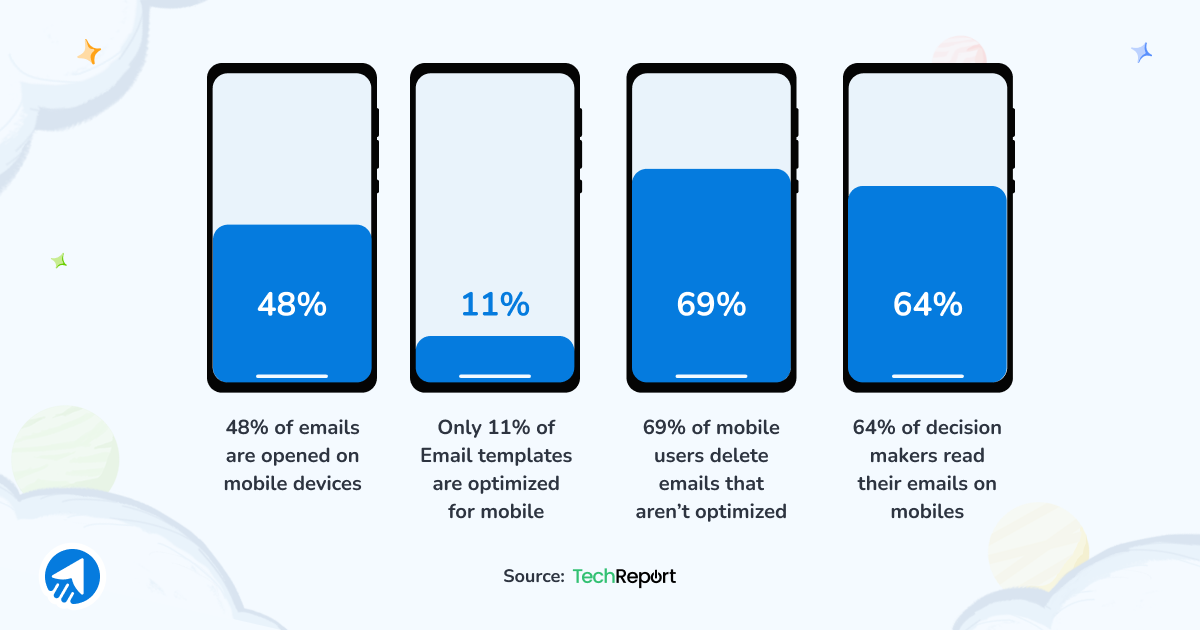
In 2023, a whopping 48% of emails are now opened on a mobile device, while just 11% of email templates are designed with smartphone users in mind.
Moving forward, email design will center around smaller screens. In 2024, email marketers must consider an omnichannel approach to achieve a successful open rate.
“Short subject lines, mobile-optimized designs, and relevant content all shape how a user responds to email. But, at the end of the day, the goal is usually to get them to click over to something. So think through the entire experience to ensure it is optimized for mobile from start to finish.”
Randy Shattuck from The Shattuck Group.
With this in mind, let’s look at five different ways to optimize your own email design for mobile UX success.
9 Ways to Optimize Your Email Design
Introduce Responsive Email Design for All Devices
Responsive email design needs to be a top priority for email marketers in 2024. Ensuring that users on all devices can engage with your content is the key to boosting your user experience.
One of the hardest groups of consumers to please is mobile browsers. With a staggering 80% of mobile users likely to delete your email if they can’t engage with it on a mobile device. Therefore, it’s essential that you test your designs for a mobile-first audience in 2024.
“Test designing emails that are exclusively for mobile. On mobile devices especially, a user’s first instinct is to scroll. Marketers can leverage “long scroll” emails that completely disregard the fold. This opens up the opportunity for brands to design an immersive experience that easily guides a user through the messaging.”
Matt Doud, CEO at Planit.
The key here is to integrate ‘tappable’ content into your email design. Give your mobile users the ability to respond by interacting with clear call-to-action buttons and tappable links to various social apps and web pages.
The more responsive your email design is on a smaller screen, the more interaction you’ll see within the inbox.
Craft Compelling Subject Lines
Mobile users have shorter attention spans and tend to skim through their emails at speed. Therefore, a concise and compelling attitude to email copywriting is essential when optimizing the mobile UX of your emails.
“Use perfect email subject lines and snippets to create more mobile-friendly emails. These aspects do the heavy lifting of capturing a reader’s attention and given functionality will dictate what a reader sees on their mobile device.”
Keri Witman, email marketer at Cleriti.
Take this great example from Bloom and Wild:
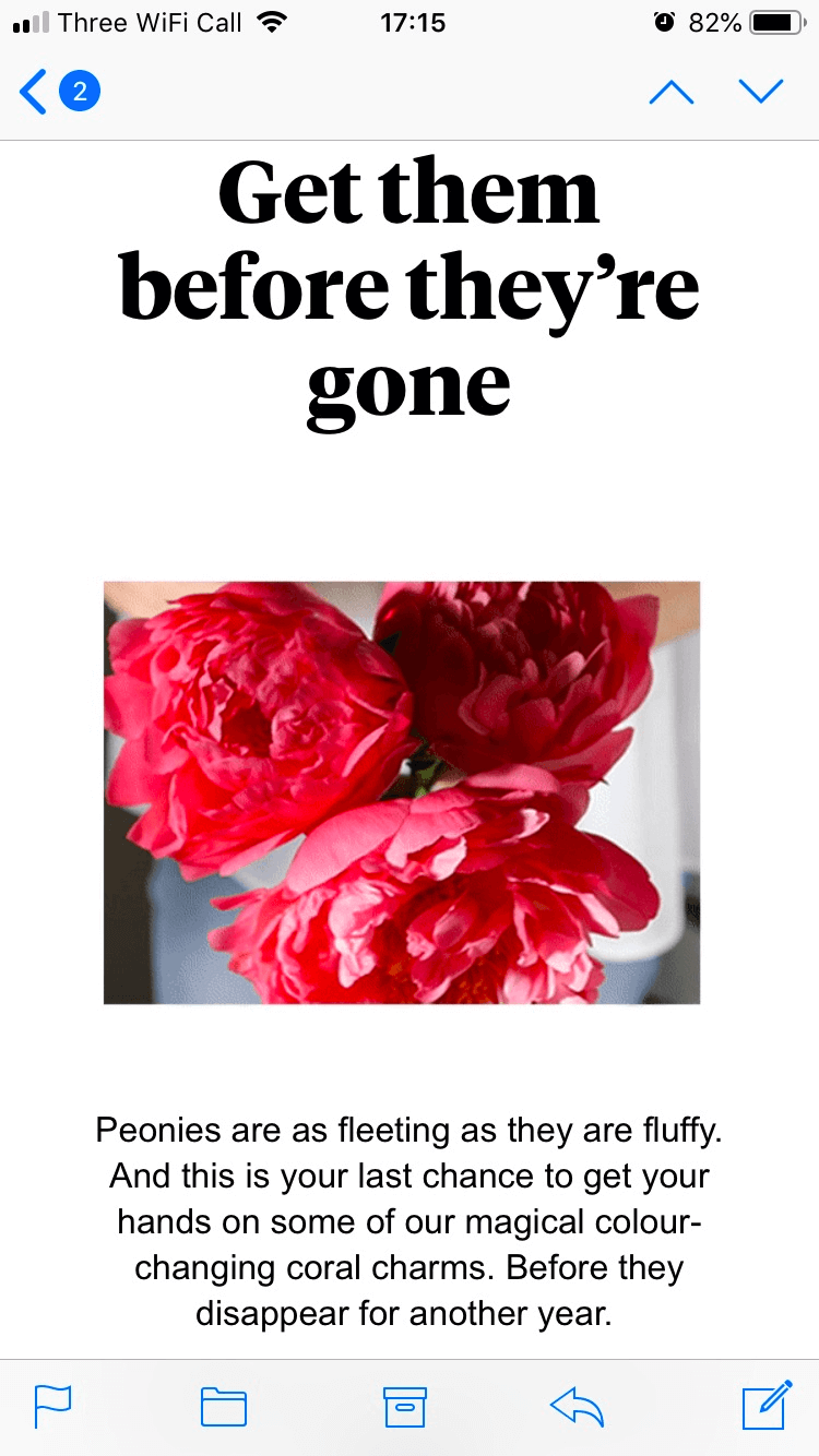
Using a quick and actionable subject line such as ‘Get them before they’re gone’ is a great way to attract consumer attention and create that sense of urgency that all mobile marketing campaigns require.
Trial Scalable and Fluid Designs
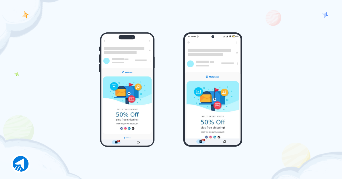
If you want your email design to succeed on a mobile device, it has to be scalable. Scalable designs work well on any screen size or shape as they prioritize a layout that can fill the entire screen with ease.
Not only do scalable email designs improve readability across several devices, but they do not require coding to adjust to each screen. Instead, scalable designs work using a grid system for screen alignment. This ensures that while on a desktop, the email design fills a large screen with smaller, clickable buttons, but when shown on a mobile screen, the design shrinks into a single grid column with larger clickable buttons for easy access.
As you can see in the image above, the scalable design naturally scales to fit any screen for maximum readability.
Another option to try when optimizing your email design for mobile UX is a fluid design. While these tend to be trickier to implement, their percent-based sizing approach offers a much more streamlined adaption to each device.
Scalable designs adjust only the length of an email across devices, while fluid designs can also modify image and table widths, as well as text size, to enhance engagement.
This is also known as a liquid layout, where content flows out to fill the screen. These tend to work best for text-heavy email designs as they allow for text sizes to be adjusted to the screen on a more accurate basis as there are fewer images to consider.
Improve Your Mobile Readability
Your mobile readability is essential when it comes to device-friendly email design. With over 1.7 billion people now opening all emails on a mobile device, it’s essential that your content quickly grabs their attention and is easy to digest in a short amount of time.
Mobile inboxes are known for being opened and closed quickly at different periods during the day. Therefore, your email must be quickly scannable and require zero effort for the consumer to zoom in and out of long reels of text.
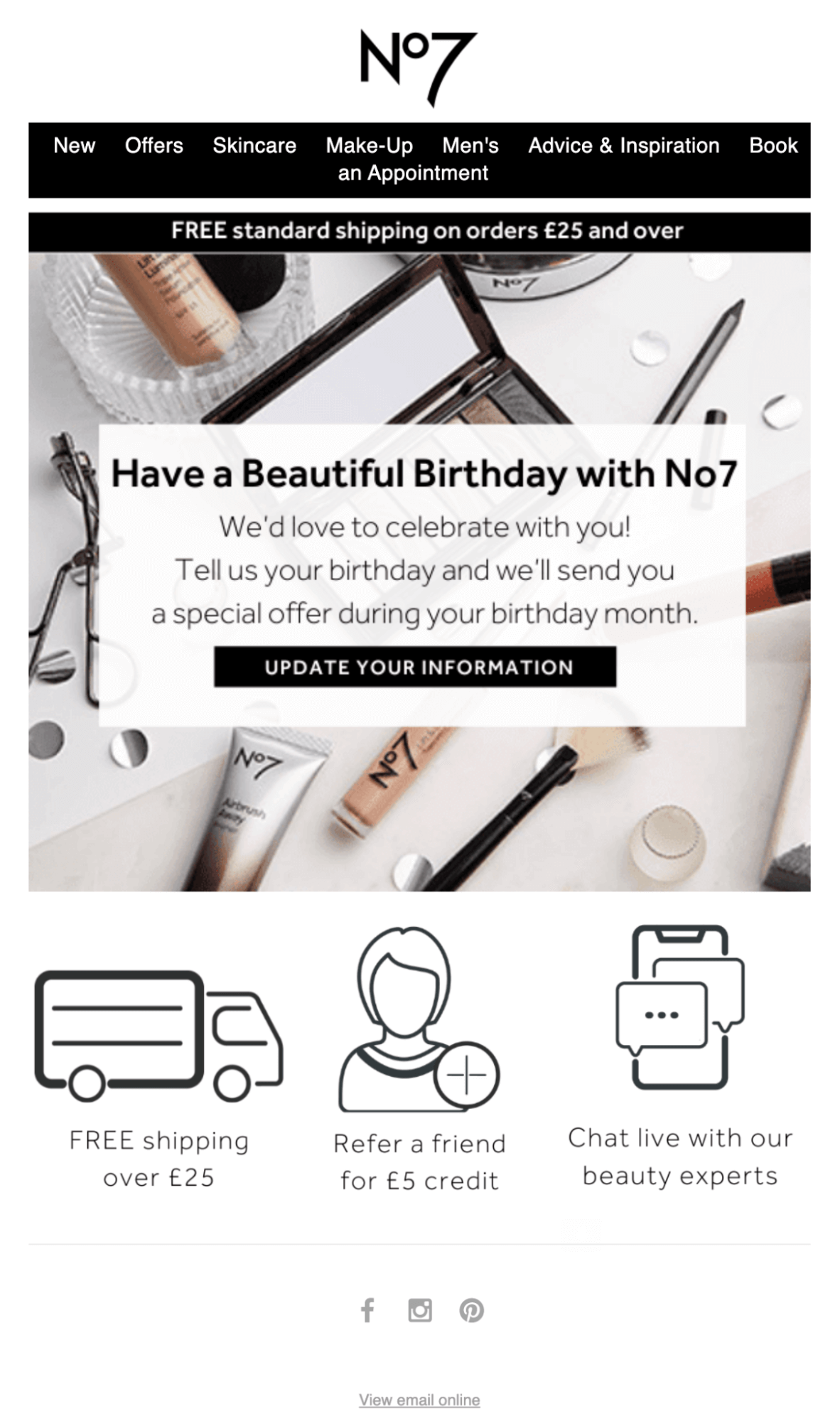
The key here is to create an email design layout that works well with all inbox consumers. We suggest using a single-column layout as this is the most seamless approach for a small screen. Avoiding a multi-column layout is essential if you want your email design to look less cluttered.
Take this example from No7. Their email is set out in a single-column design and prioritizes less text and more graphics. This makes it easier for the consumer to quickly scan the call-to-action and interact with the email with ease.
Better still, why not also left-align your email copy for improved mobile readability? If you can’t avoid larger chunks of text in your email design, it’s best to align your copy to the left, as this is the natural anchor for our eyes when jumping from line to line.
Also, ensure that your paragraphs are well-spaced when designing an email with a large chunk of text. While this makes the email longer, it improves readability for small-screen consumers.
Optimize Your Content for Omnichannel Viewers
On a mobile device, it is much easier to jump from channel to channel. Many users hop between Instagram, their inbox, and Google in just a few seconds, so it’s important that your email facilitates this seamless movement.
One way to do this is to work on your link-building strategy and embed links and buttons to other channels from the email design itself.
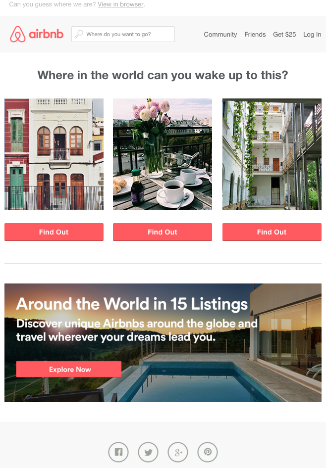
Airbnb provides a great example of this. Using their social channels to advertise their stays, they offer a window into Instagram while also showcasing UGC content, a great seller in itself.
Don’t Forget Your Alt Text
What happens if your email image doesn’t load? There are plenty of reasons for this, including a slow internet connection, older mobile devices, and even manual disabling of images.
This is why it is important not to forget the ALT text in your email design. ALT text acts as a hidden caption, describing exactly what your visual elements contain in case they can’t be seen.
Not only does this make your email design readable on devices of all abilities, but it also aids users of all abilities.
So the key point is to keep your ALT text short and sweet and ensure that you repeat any text that also appears in the image so your subscribers don’t miss a thing.
Prioritize Mobile-Friendly Calls to Action (CTAs)
If you’re an e-commerce business, call-to-action buttons are the key driver of email design success. We’ve established that mobile users seamlessly jump from channel to channel, so using your email to direct them straight to the checkout is genius.
Inserting the perfect CTA is difficult. The skill here is to identify the perfect spot for placement. Instead of placing your call-to-action button at the bottom of your email design, switch it up and add it at the top. Mobile users have smaller attention spans and are likely not to read the body of the email. If your call-to-action is the first thing they see, you’re much more likely to get them clicking.
Take this example from Wayfair:
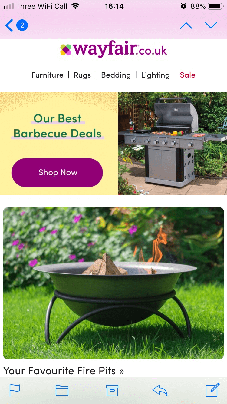
By positioning the CTA at the top of the mobile email design, consumers are instantly greeted with a link to your product. They may not read the rest of your email, but they’re more likely to end up at the checkout.
Optimize Load Times for UX Success
Last but not least, let’s talk about loading times. Mobile consumers value speed, so your email loading time could be a make or break for your campaign.
Optimizing elements such as high-resolution images and heavy graphics is essential if you want to cut your email loading time in half. This process reduces UX frustration and contributes to a much higher open rate for your emails.
Better still, why not look into email hosting? With the right hosting package, you can choose load-friendly templates for mobile emails. Thus, you can ensure that all personalization you add to your emails is optimized for a positive user experience.
A fast-loading email design encourages recipients to promptly engage with your updates and promotional offers, in turn boosting your chances for online conversion.
Test, Test, Test
Last but not least, ensure that you test, test, and test your email design. Email marketing is tricky at the best of times, so it’s likely to take you a few shots at a perfect mobile UX design. If you pour all of your design budgets into guesswork, you could see your engagement drop and your money go down the drain.
In order to avoid this, make sure you test each and every element of your email design across multiple devices.
We recommend A/B testing a few different versions of your email design and recording the success of each approach. The one that performs best during the A/B testing stage is the one you should send live for your subscribers.
Mobile UX: An Email Strategy Essential
As we enter 2024, your mobile UX strategy should be a top priority if you want to drive success online.
Research shows launching a mobile-responsive email campaign increases clicks by 15%; hence more brands are adopting mobile UX tactics.
From optimizing your content layout and loading time to crafting speed-read subject lines, renovating your email design strategy for multi-device success is a challenge all marketers must face in 2024.
 Contents