


Mobile phone usage is widespread in this digital age. People use mobile devices frequently to check their daily emails or other notifications, keep in touch with family members, conduct business and deals, do online shopping, etc. Therefore, you cannot ignore the mobile market if you are a true email marketer. This blog will specifically give in-depth advice on creating a mobile friendly email.
What is a mobile friendly email?
A mobile-friendly email is a design that fits appropriately on every mobile screen. A mobile-friendly email ensures that mobile-using subscribers/customers will have a good user experience when they check their inboxes by mobile. Your email receiver won’t need to bother zooming in or out as much to view your email if it is mobile-friendly.
Why is mobile friendly email important?
As a marketer, you should know that several types of subscribers can read your email. So, there is a huge chance that mobile users can check your email more frequently. That is why you must consider mobile-friendly email design while preparing and sending an email marketing campaign.
408.2 billion emails will be sent and received daily in 2027, most of which will be opened by mobile devices like smartphones and tablets.
Statista
41.6% of emails were opened on mobile in August 2021, and the ratio is growing. On the other hand, email openings on desktops are only 16.2%. Although after Apple launched its Mail Privacy Protection (MPP) in late 2021, there have been drastic changes in email open rate for mobile. However, according to a report by 99 Firms, smartphones have become the primary devices for checking email for 85% of users. From these statistics, we can understand a couple of points, such as
- Globally, the number of email users is rising quickly.
- People are way more comfortable opening emails on mobile devices.
- Many more emails are being opened on mobile devices than there were previously.
Why do people use mobile to check their emails?
An email is a widely used form of interaction with people worldwide. Your audience can respond to your email through a computer or mobile device. But the question arises when and why they may use their mobile device instead of a computer. Firstly, not everyone needs a computer or has access to it. Secondly, some people have a desktop rather than a notebook/laptop. The desktop is not that much usable remotely. But a notebook is. But when you compare these two with a smartphone – you can see the significant differences. The smartphone is way more portable and user-friendly.
According to BankMyCell 2024 report, there are around 7.21 billion smartphone users worldwide, equating to 60.42 % of the global population. So, it is clear that the chance of using a smartphone for checking email is exceptionally high. Lastly, carrying a smartphone is remarkably more accessible than other devices. That’s why people are more comfortable checking their email on mobile devices. Especially when anyone is running out of time, they can bring out their mobile device and check their email update with a particular app or even a mobile-friendly web browser. In a nutshell, checking email on a mobile device is simple, easy, and time-efficient.
Tips to make your emails more mobile friendly
After discovering the necessity of a mobile-friendly email, you need to consider some more steps to make your email mobile display responsive. You should design an email campaign with mobile display compatibility for your mobile user. To do so, you need to follow some must-follow guidelines. Like –
- Compose short and catchy subject lines.
- Use pre-header text (optional but effective).
- Don’t forget about CTA (Call to Action) buttons.
- Use responsive email templates.
- Choose the correct font size.
- Test and preview your emails.
1Compose short and catchy subject lines
Mobile and computer displays are not the same in terms of screen size, especially wideness. So, you must make your email subject line short and eye-catching. Even more straightforward than a regular computer-oriented email’s subject line. The first thing an email receiver can notice is the email subject line. A good subject line can significantly increase the email’s open rate. Also, an excellent mobile-friendly subject line will help grab the email receiver’s attention. Although making a short subject line is easy, making it catchy is way trickier than you can imagine. You may visit this blog to get a clear idea of how to present a good subject line.
2Use pre-header text
The pre-header text is a summary version of a text that appears after the email subject line. Email marketers often ignore the pre-header text. But when it comes to mobile-friendly email, it is vital. The pre-header text should highlight the most important message of your entire email at the very beginning. So, before opening the email, an email receiver needs to get attracted to open the email.
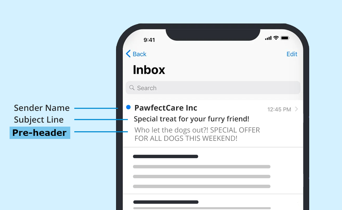
A good pre-header will explain to the email receivers what they may expect from the email. So, you should maintain a short and relevant pre-header text. You may wonder how you can set up preheader text. You can edit your preheader text using HTML code, which is quite tricky. Don’t be tense. MailBluster can guide you on adding preheader text if you wish to implement it in your email campaign.
3Don’t forget about CTA (Call to Action) buttons
CTA buttons are a crucial part of any email campaign. The email sender linked their service or any other pertinent website or webpage to the CTA button. But when it comes to mobile-friendly email marketing, a couple of critical things need to be of concern. Since the mobile screen is much smaller than any other device’s (e.g., monitor, notebook, desktop), the CTA button must be a clear image- or text-based. According to 99designs, at least 16 px of font size is recommended for text-based CTA buttons and 44×44 px for any design-based CTA buttons. However, here are some more tips regarding the mobile-friendly CTA button –
- Try to avoid the text-based CTA button. Because sometimes it is too small to tap and see.
- Place your CTA button in a prominent place so the receiver can see it easily.
- A big CTA button is not recommended at all.
4Use responsive email templates
An email template will allow you to lead your users to your message quickly. You can import the highlighted things from your email campaign into one template. But in terms of mobile, the template needs to be mobile-responsive. You must avoid any complicated and extensive template that might not display appropriately on the receiver’s mobile screen. For mobile devices, the single-column template design is highly recommended. Creating or finding a perfect single-column template is a pretty time-consuming process. Also, there can be a chance that your template might not display correctly on different email receivers’ mobile screens. So, while creating it manually, you must plan and implement many things appropriately. However, a responsive email template is a real-time saver tactic when using a proper email marketing tool. You can try MailBluster here to make a mobile-friendly email template. It has a good collection of templates optimized for mobile screens, tablets, and desktops.
5Choose the correct font size
You must make sure that reading the email’s body text is effortless. Mobile device display size or screen is usually small. Therefore, you can not use a tiny font in your email. Otherwise, the reader has to zoom in on your email to read out. It will indeed be tiring for your email reserves if they always need to do this. Therefore, you should avoid tiny fonts.
On the other hand, using relatively large fonts is easier to read and helps keep your emails short and simple. Also, the font must use a strong contrast of colors (like the dark text on a white background). It will help to make your test smoother in the reader’s eye. Many people use a battery saver mood by turning down the brightness level on their mobile. Also, some may check their email on their mobile while outside in the sunlight. So, in that case, strong contrast of colors will be relatively easier to read.
6Test and preview your emails
Before scheduling or sending your email campaign, you need to run a test and preview it as well. You have one condition: your email needs to be mobile-friendly. To ensure that your mobile-friendly email campaign will work, it is highly recommended that you run A/B testing. You can create two versions of your email and text them for two device types (Android and IOS). Therefore, you can run the test separately to get some precise results. After completing the test, you will be completely ready with your final draft of the mobile-friendly email. But before sending the email to your subscribers, you must preview your email to see how it will look on your subscriber’s end. To make the email testing and previewing in one place, you should use an email marketing tool that will be effective and cost-efficient.
Conclusion
Mobile-friendly email designs are always essential, given that mobile users are rising gradually worldwide. The email open rate by mobile users is significantly increased by a mobile-friendly email. However, when using MailBluster, your email campaigns will be automatically responsive and mobile-friendly. So, you may visit MailBluster to experience and use all the features.
 Contents