Are you aware of the wonders you can do with a newsletter sign up landing page? No? Well, you are about to! The efficacy of a newsletter landing page is enormous. For instance, with a clear and easy-to-complete form on your newsletter signup page, you can easily turn your online visitors into subscribers. This means you’ll be able to grow your email list legally through it. And that’s not all. The benefits are so much more.
In this blog, I will discuss the efficacy and examples of the best newsletter sign-up landing page. Go over all the newsletter signup examples and learn about this essential medium to improve your email marketing.
Table of Contents
- What is Sign Up for Newsletter?
- What is Newsletter Sign Up Landing Page?
- 5 Best Newsletter Landing Page Examples
- Benefits of Using a Newsletter Landing Page
- What are The Elements of a Sign-up Page?
- Tips to Create a Newsletter Sign Up Landing Page
- Wrap Up
What is Sign Up for Newsletter?
Before learning about the newsletter landing page, you first need to know what is sign up for newsletter means. When we talk about newsletter signup, we mean the process by which visitors choose to receive information from an online business via email. Visitors can sign up for email newsletters by simply entering their email address and personal details and clicking the CTA button to subscribe or join. Some also call it by subscription landing page, and subscription forms. 79% of U.S. customers prefer that brands contact them by email. Also, 57% of Generation Z agreed with it. So, it’s essential to include your audiences in your email list.
What is Newsletter Sign Up Landing Page?
A newsletter sign up landing page is a web page created with a specific aim to increase newsletter signups. It’s a fantastic medium through which you can gain a lot of benefits, which is why you need to use a newsletter signup landing page.
Difference between landing page and newsletter
Your newsletter serves as a link between the current location of your audience and their desired destination. The purpose of your landing page is to help them see your newsletter as the ideal next step in getting closer to their purpose.
Why do you need it?
You need a newsletter signup landing page to give your website visitors a better user experience and to grab their interest and consent to receive your newsletters. 31% of marketers use email newsletters as a top medium to nurture their leads. Moreover, among various modes of sign-up, landing pages have the greatest conversion rates (23%) among them. Removing distractions like sidebars, pop-ups, etc., is important to hold visitors’ attention and interest. And a separate landing page for newsletters is a solution for it as it will lead the visitors to a particular page. So, their attention will be solely on that part only. Their focus will not roam around but will be on joining your email list. Therefore, it is crucial for you to set up a newsletter landing page.
5 Best Newsletter Landing Page Examples
For better ideas, let’s move on to 5 best newsletter landing page examples!
Newsletter landing page template;
example 1
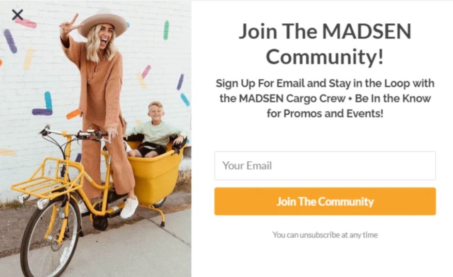
Madsen Cyles’s previous newsletter landing page is apparent and well organized. It starts with a headline that urges the visitors to “Join the Madsen Community!” Underneath that, it has a brief description that mentions the purpose and visitor’s expectation of joining it.
After that comes the register form, which is very easy to follow. It simply requires your email address followed by a catchy CTA button titled as “Join the Community.” Visitors just have to fill the empty box with their email and then click the given CTA, and then they’ll be joined. So, easy peasy, right? Also, they end by assuring that their newsletter subscribers are free to “unsubscribe at any time.” You can follow this to craft the best newsletter landing page.
Example 2
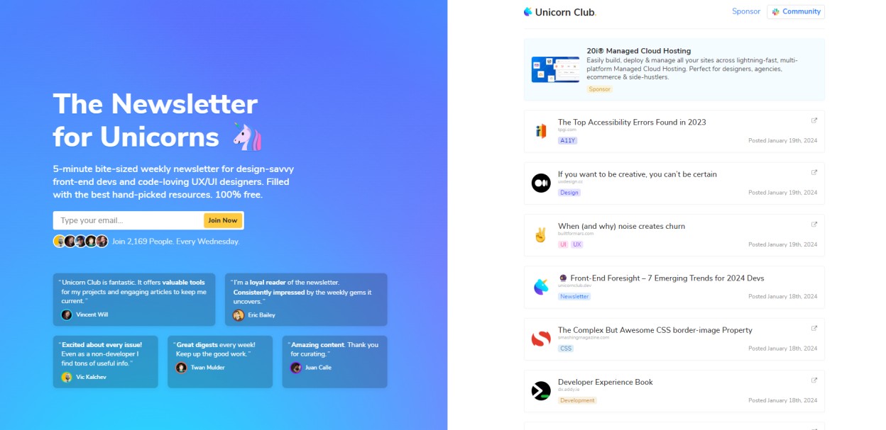
Unicorn Club’s newsletter landing page template can also be a great sign up to newsletter examples. The headline “The newsletter for unicorns” is attractive and simple, and they made it extra eye-catching with a unicorn emoji. And the fact that they are addressing their subscribers as “unicorns” also gives it a friendly touch.
The rest are well organized, too. The brief description nicely explains the intent and expectations. The register box and CTA are easy to understand.
After that, it shows the present numbers of their newsletter subscribers. Finally, they end by providing testimonials for social proof, which will definitely work in improving credibility. This one undoubtedly is an effective subscription landing page example. Implement these points to make the best newsletter landing page.
Example 3
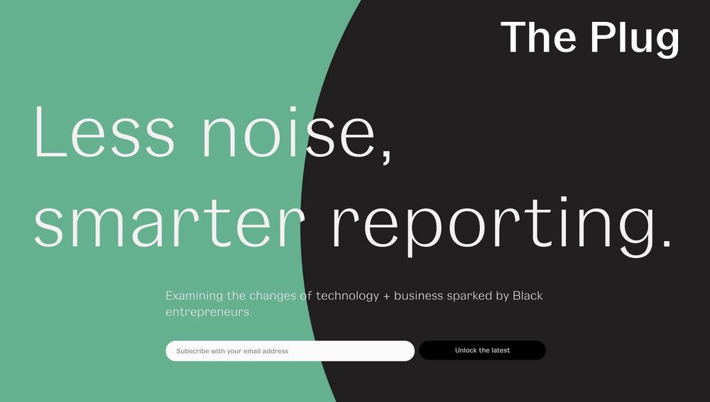
This notable newsletter landing page template was previously used by The Plug. It is very simple and easy to follow. It starts by highlighting the headline “Less noise, smarter reporting,” which is fantastic as it indicates how email can report smartly with less noise.
The short description, email bar, and registration CTA are clear and well-organized, too. So, if you want to make a simple but meaningful newsletter sign up landing page then you can follow this one.
Example 4
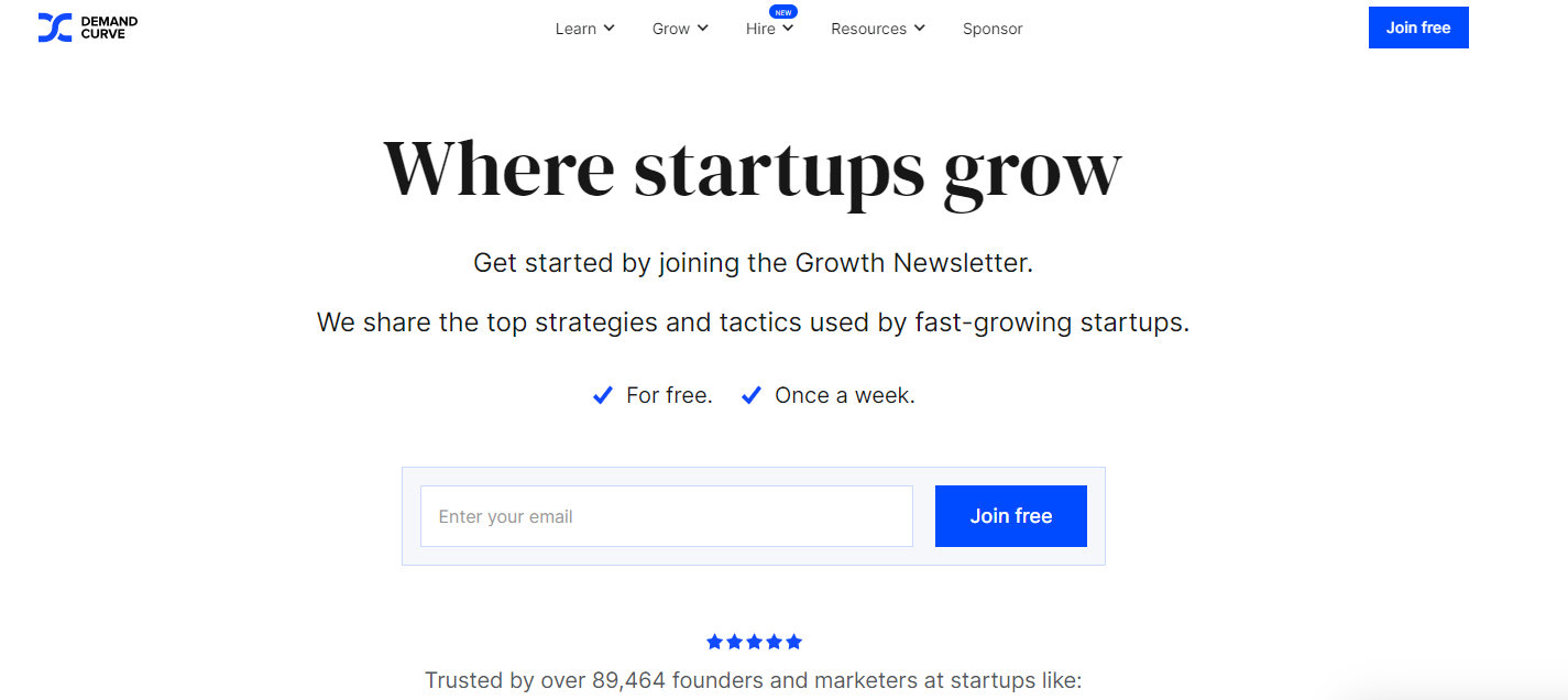
This Demand Curve‘s newsletter sign-up landing page is very cleanly organized. It starts with the headline, “Where startups grow.” The description provides both the purpose and expectations in just two lines.
It also mentions that this newsletter service is free, and the subscribers will receive it weekly, just once a week. This assures the visitors that they don’t need to worry about getting bombarded with their newsletters if they decide to join. They will hear from them in a very moderate amount. The register box and CTA are simple and easy to follow, too. Including such points in your landing page could bring the best results!
Example 5

The final noteworthy newsletter sign up page is from Trends.vc. The headline sounds excellent; it urges the audiences to “dive into new markets and ideas” with other, more than 65k similar-minded founders.
The description mentions its aim and expectations that the subscribers will get “5-minute reports on AI, Crypto, and more.” The email address providing box and CTA for the registration are nicely organized, too.
And it ends by showing the present numbers of their newsletter subscribers. Do you think this one is helpful? Then, implement it to create the best newsletter signup landing page.
Benefits of Using a Newsletter Landing Page
Let’s find out such great benefits achievable with a newsletter landing page.
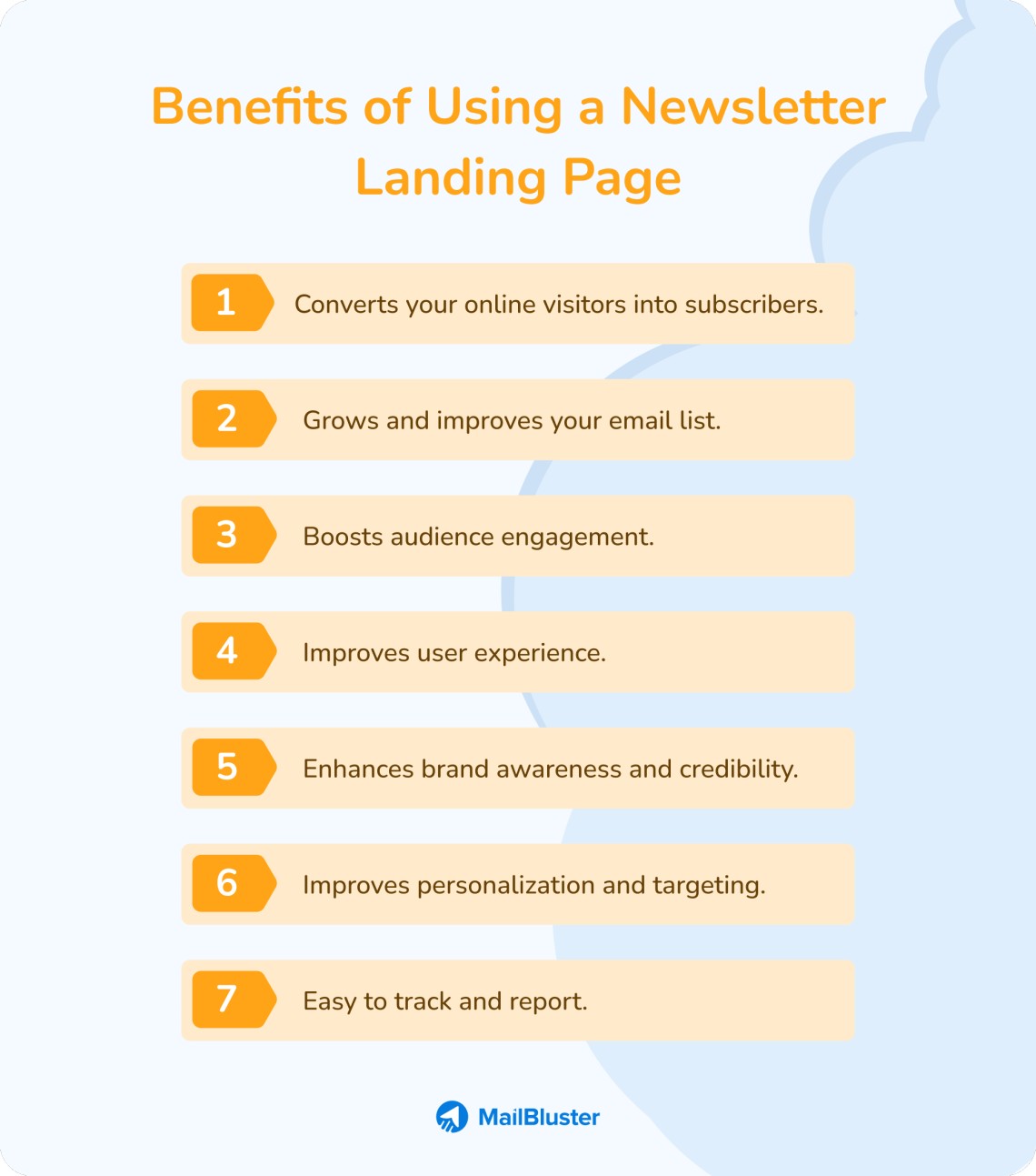
Converts your online visitors into subscribers
Getting people to subscribe to your newsletter is just the beginning of email marketing. The targeting strategy of creating a separate web page with no distractions and a clear CTA (call-to-action) button has the potential to greatly boost the chances of converting visitors into subscribers.
Grows and improves your email list
As you know, it helps to convert visitors into subscribers. That means it will automatically aid in growing your email list legally. How? Well, a legal email list is a list of leads who are willing to receive your marketing emails. And here, whoever will sign up through the newsletter landing page will do it with their consent. Meaning, they are willing to get and reciprocate with your newsletters. Thus, your email list will keep on increasing legally, with leads who have shown interest in being your subscribers.
Boosts audience engagement
Now you know that with a newsletter landing page, you can legally grow your email list. You will also end up with another benefit: boosting your engagement with your newsletter subscribers. As the subscribers, with their consent, have subscribed, they will read and engage with your marketing emails willingly. Not only that, it will increase your click-to-open rate, too. Thus, it will boost your overall engagement in email marketing. See, how can just one benefit lead you to another? Marvelous!
Improves user experience
I have already discussed that you need a separate landing page for newsletters to ensure a better user experience for your visitors. The distractionless landing page will provide visitors with a user-friendly experience, so they will be happy while visiting your website. Hence, it will improve the user experience, and your brand will also be marked positively in their minds.
Enhances brand awareness and credibility
Building brand awareness, reputation, and credibility is essential for any business or organization, and a landing page for email signups can help you get there. Therefore, create a landing page that reflects your brand’s messaging and design to provide a consistent and familiar experience for your potential subscribers. This consistency can help develop trust and credibility with your audience, increasing the possibility that they will subscribe to your email and interact with your company in the future. A landing page can also help you demonstrate your brand’s unique value proposition and advantages, allowing you to differentiate yourself from competitors and establish yourself as an industry thought leader.
Furthermore, a newsletter landing page can help you create a community of loyal subscribers who feel linked to your business and are more willing to spread your content and, at the same time, refer others to it. Thus, by establishing a consistent and attractive landing page for your newsletter signing up, you can increase brand awareness and credibility, resulting in more conversions, more engagement, and a deeper relationship with your audience.
Improves personalization and targeting
Personalization is essential for successful email marketing. By utilizing a landing page for newsletter signup, you may gather more particular information about your subscribers, allowing you to develop more focused and personalized email campaigns. Using a custom form on your landing page, you may collect data such as name, location, gender, interests, and other pertinent information through which you’ll be able to segment your list and send more relevant content to each subscriber. This tailored strategy can boost your email’s engagement, open rates, and overall user experience.
Easy to track and report
Tracking and reporting are essential for the measurement of how well your email marketing strategy is doing and for discovering opportunities for improvement. A landing page for newsletter signups can make tracking and reporting more efficient and accurate than other techniques. A sign up landing page allows you to track user behavior, such as the number of clicks, time spent on the page, and whether or not they subscribed. This information might help you determine which portions of your landing page are effective and which require improvement.
So, how to create a landing page for a newsletter? And how to get people to sign up for the newsletter landing page? Let’s find out!
What are The Elements of a Sign-up Page?
The main elements of a sign-up page:
- A compelling headline.
- A brief description.
- A brief registration form.
- An effective CTA.
Tips to Create a Newsletter Sign Up Landing Page
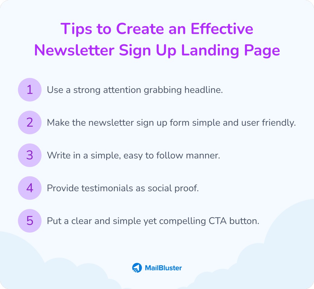
Use a strong attention grabbing headline
The headline of your newsletter is essential since it creates the initial impression for your readers. So you should use a strong attention grabbing headline. Also, you should explain what your newsletter offers. Consider briefly describing 1-3 sentences beneath the headline to provide further context and educate your visitors. Mostly, write the purpose of your newsletters and what the subscribers can expect from them.
Make the newsletter sign up form simple and user friendly
You need to make the sign up form simple and user-friendly. You can use your email marketing platform for this. Like, most marketers and freelancers can use our MailBluster forms for subscriber collection, specifically for newsletters. Join our handy and price-friendly email marketing platform, MailBluster, to implement this feature.
Write in a simple, easy to follow manner
You need to write the heading, description, and all the texts in a simple, easy-to-follow manner so the visitors don’t find it hard to understand.
Provide testimonials as social proof
It’s better to provide testimonials as social proof so that the visitors will trust your service after seeing them. Trust me, testimonial advertising is very effective for earning customers’ trust. Not only that, it will aid in building your credibility, too.
Put a clear and simple yet compelling CTA button
You need to put a simple yet compelling CTA button so it catches visitors’ eyes. Hence, in order to make it catchy, consider organizing it with a good title and suitable color.
Wrap Up
Throughout this blog, I have discussed the efficacy and examples of best newsletter sign up landing page. You may iterate all these newsletter signup examples and implement all the ideas and tips you have gathered from this discussion while creating one. Hopefully, it will aid in making your newsletter landing page effective and stand out from others.








 Contents
