


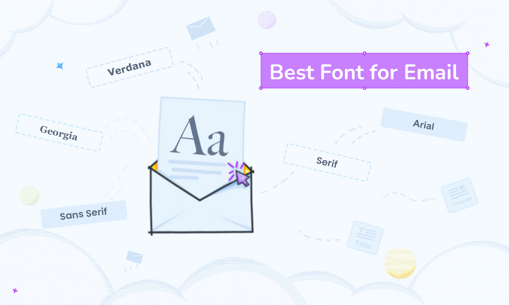
Choosing the best font for email is crucial, especially for email marketing. The font you select in email campaigns can significantly impact how your prospects view your brand or your way of digital communication. The email font is like the root of your email message, especially the body part, and it needs a proper visual look. When choosing the best web safe email font, several facts need consideration. Learning about different email safe fonts and identifying which one to use and when is essential.
In this blog, I will guide you in choosing the best email fonts. And for that, we will discuss this email font subject in depth with necessary examples.
Table of Contents
- 3 Key Reasons Why Choosing the Best Font for Email Matters
- Best Font for Email: With 6 Font Examples
- Wrap Up
3 Key Reasons Why Choosing the Best Font for Email Matters
Let’s find out why we need to be concerned about selecting the best email font. 3 main facts behind choosing the best font are:
Readability
At first comes the readability fact. The goodness of a font is first measured by its readability level. This means that the font should be easy to follow so the recipient doesn’t have any trouble reading your email. Hence, choose a font that is easy on the eyes and ensures good readability.
Psychological impact
Fonts are measured in terms of psychological or emotional aspects, too. Yes, fonts can impact the human psyche. Different fonts can impact different readers based on their psychological condition. For example, while dealing with professional stuff, your professional email font and size need to meet professional standards. For example, using a Sans Serif font for professional email is good. On the other hand, if you use an over-styled font like Caveat font in professional emails, then the reader’s psyche will take it as an extreme act of unprofessionalism and even mark you as a weirdo. So, don’t be a weirdo, and choose the font of an email wisely.
Brand standard and consistency
Maintaining the brand standard and consistency is another essential reason behind going for the best font. You need to choose an email font that suitably goes with the standard of your business and brand. A well-suited font reflects the quality of communication for any business. Choosing a bad font can hamper the brand’s reputation and quality. Therefore, you must be careful while selecting the best font for emails to deliver a good email marketing customer journey.
Best Font for Email: With 6 Font Examples
Let’s learn about 6 best fonts for emails with examples. Get familiar with these popular fonts and choose the most efficient and suitable one that meets your requirements or the standard of your business.
Sans Serif
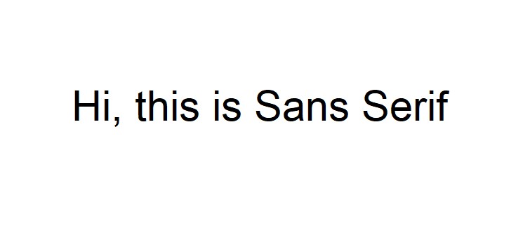
Sans Serif is a font family or category. It includes fonts like Arial and Verdana which means these two belong to the Sans Serif font category. Sans Serif font is the most readable and web-safe font. It’s highly used because of its ideality for most email body text.
Why go for the Sans Serif font for email?
Because Sans serif fonts are widely regarded as easier to read on screens, particularly smaller sizes, which is vital for email view. Plus, the Sans Serif font is preferable for its modern look, which is the key point of being an efficient digital screen readability font.
Moreover, using it is “web safe,” meaning most devices will display it properly. And that makes this font a versatile choice for various email marketing types like business newsletters and sales emails. According to general font statistics, the Sans Serif fonts are preferable on mobile devices because of their clarity and readability on small digital screens. All these facts hint that Sans Serif can be the best font for email.
Key points of using Sans Serif fonts in emails check in terms of:
- Readability
- Professional appearance
- Wide compatibility
- Versatility
- Trend or Modern feel
More about Sans Family fonts
Some popular fonts that belong to the Sans Serif font family are Arial, Open Sans, Helvetica, Tahoma, Verdana, etc.
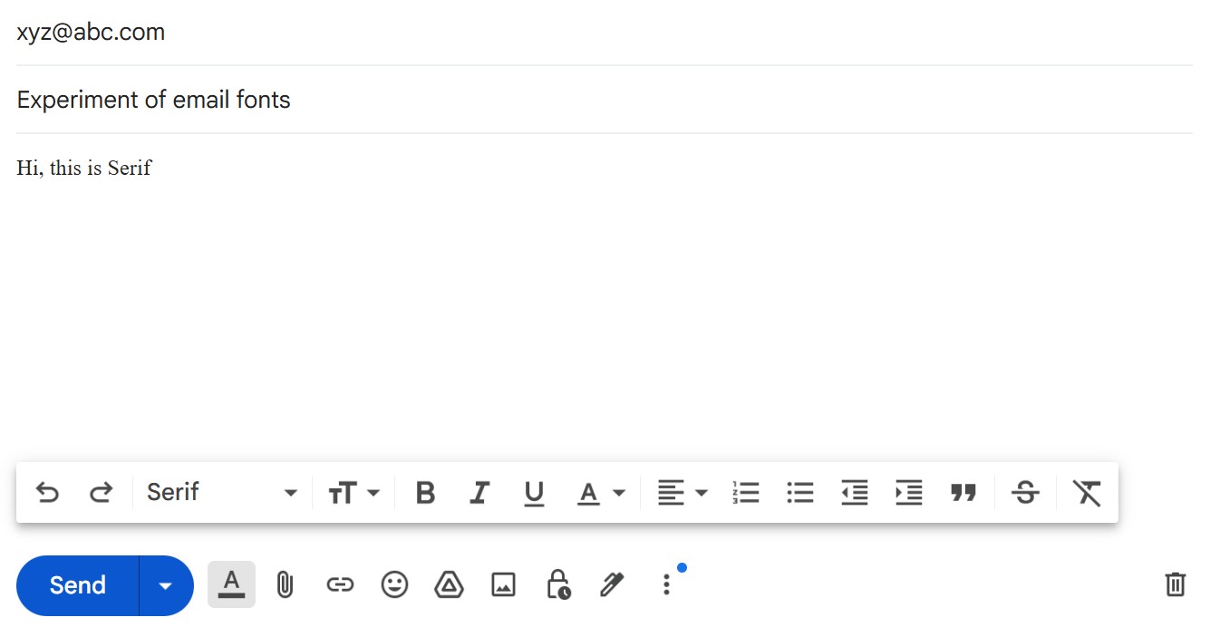
However, you don’t need to be aware of various Sans Serif family fonts in Gmail because there is a particular font titled Sans Serif; you can just select it and write your email. So, there is no room for confusion about which Sans Serif font you should use. For clarity, see the following example of the Sans Serif font in Gmail.

Serif
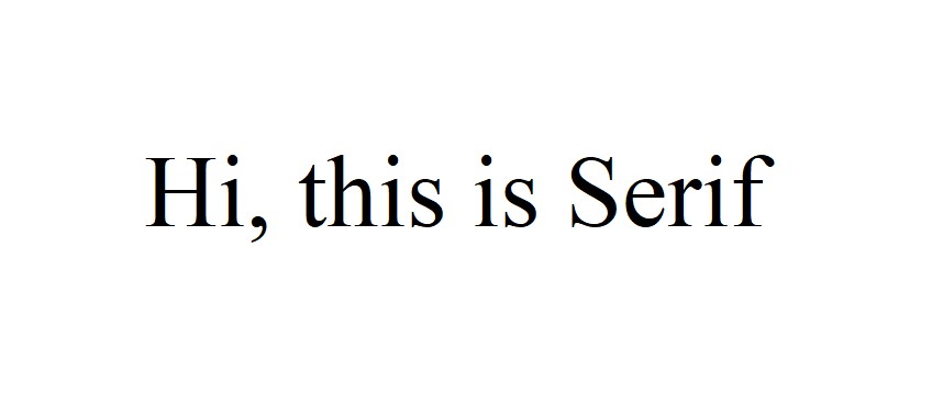
Serif is usually regarded as a font family or category just like the Sans Serif. And “Times New Roman” is a widely used and recognized font that belongs to this category. Serif fonts are mostly preferred in terms of professional and formal use, especially for long messages or lengthy documents and writing pieces.
Why go for the Serif font for email?
First, see what your email is for and how lengthy it can be. If your email is formal and lengthy, then you can choose the Serif font for your email.
Key points of using Serif fonts in emails check in terms of:
- Readability
- Classic appearance
- Formal use
More about Serif Family fonts
Some popular fonts that belong to the Serif font family are Times New Roman, Georgia, Garamond, Didot, etc.
However, you don’t need to be aware of different Serif family fonts in Gmail because there is a particular font titled Serif just like the previous one; you can just select it and start writing your email. So you can be confusion-free about which serif font you should use. Check out the following example of the Serif font in Gmail for better.
Serif vs Sans Serif
Now, as you’re aware of both the Serif and Sans Serif family fonts, let’s go over the main difference between these two!
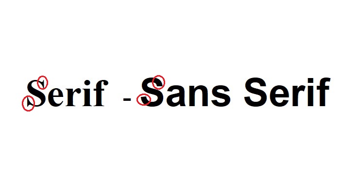
Look at the parts I have circled for you. Serif fonts have a decorative stroke at the foot of the letter. However, the Sans Serif font has no strokes like the Serif font. Sans Serif is more of a modern, smooth-styled font, whereas the Serif is more of a classic-styled font. Lastly, as mentioned before, the Sans Serif font is a more web safe typeface than the Serif font.
Best font size for email
What are the differences in their font sizes?
For best Sans Serif size:
- For body text: 14px-16px
- Headings: 18-20px
For best Sans Serif size:
- For body text: 14px
- Headings: 20-24px
Also, Sans Serif is the best font for email signatures compared to the Serif font.
So, Sans Serif vs Serif, which one wins?
In Arkansas, 85.29% of users opt for the Sans Serif font. So, surely, Sans Serif appears to be the best over Serif in terms of preference. Hence, we can say Sans Serif is suitably the best font for email.
Arial

As mentioned before, Arial is the most widely used Sans Serif font. It was originally developed by Microsoft. Arial is often considered similar to Helvetica. Some wonder if these two fonts are the same, but no, Arial and Helvetica aren’t the same.
Why go for the Arial font for email?
Arial is highly used as a web safe font and is considered one of the best email fonts. Why else? Because Arial is widely available across different email clients; making it a safe and reliable choice for most recipients. This means your email will look correct on the digital screen. Plus, it offers a clean, modern look.
Key points of using the Arial font in emails check in terms of:
- Readability
- Versatility
- Modern feel
- Compatibility
You can write in the Arial font for professional and informal emails. Use Arial, especially short to moderate lenghted emails.
Verdana

Verdana font also comes from the Sans Serif family. It can be the best font choice for emails, especially due to its easy readability on low-resolution screens. And it makes it appropriate for the small text sizes typically used in the body part of an email; its wide letter spacing further aids scannability. All these facts Verdana an email safe font.
Why choose the Verdana font for email?
Choose Verdana as the best font for email if you want your emails to be well-read on low-resolution digital screens. Plus, you don’t have to worry about professionalism because Verdana is perfect for professional emails. See the key points!
Key points of using Verdana font in emails check in terms of:
- Readability on low regulation screen
- Highly legible
- Good in wide letter-spacing
- Suitable/ supports all email clients
- Professional appearance
As you can see in the Verdana font example above, it has a different style from Arial. If you like Verdana style, use it in your email without hesitation. Not only that, coming from the Sans Serif font family, it is suitable for all email clients or ESPs (Email service providers).
Georgia
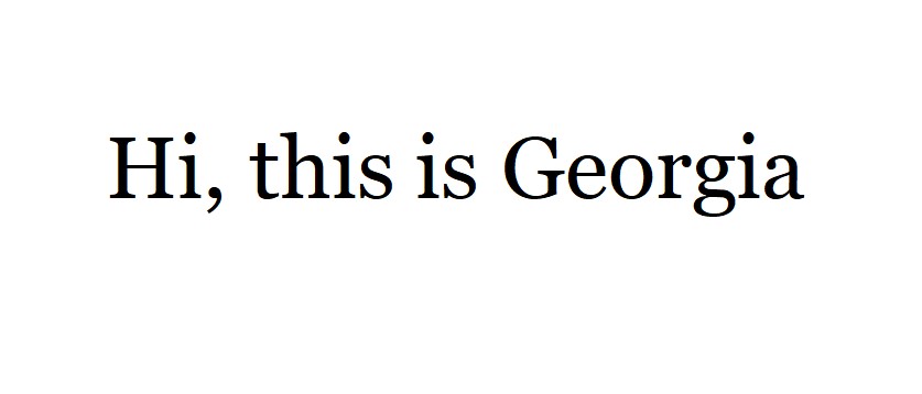
The “Georgia” font comes from the Serif font family. It ensures great readability and visual standards. Georgia font can be a great choice for those who want to give their emails a classic and detailed look.
Why choose the Georgia font for email?
Though it’s often used in newspapers, magazines, and documents, Georgia is highly readable on digital screens. It offers a formal and professional appearance, making it ideal, especially for longer email content. Georgia is also suitable for all email clients.
Key points of using Georgia font in emails check in terms of:
- Readability
- Formal/Professionalism
- Versatility
- Classic style
- Suitable for all email clients
Georgia is similar to Times New Roman font. However, Georgia font is considered more digital screen-friendly than Times New Roman. So, if you want to use a Serif family font and are wondering which one will be the best font for email, go straight for Georgia!
Global font
Global font is known as the general term for a font that is readily available globally. Global font can be used across different applications or devices within a system. This typeface is designed with the intention of supporting multiple writing and language systems.
Why choose the Global font for email?
It’s another safe-web font that allows consistent branding and good readability across different regions and cultures. The fact that it’s designed to target readers from all over the world makes it essential for companies/businesses operating internationally. How? Because it ensures a unified visual identity regardless of the language used. Simply put, you can use the Global font in email without worrying about negative impacts.
Key points of using Georgia font in emails check in terms of:
- Readability
- Wide compatibility
- Versatility
- Professionalism
- Suitable for all email clients
- Clean and modern look
This one can be the best font for email, especially when you need to ensure that your email font will be accepted worldwide. So, want to write an email that can be easily read across various cultures and languages with legibility and visual harmony? Choose it without a second thought.
Global font example
Check out the global font example below.
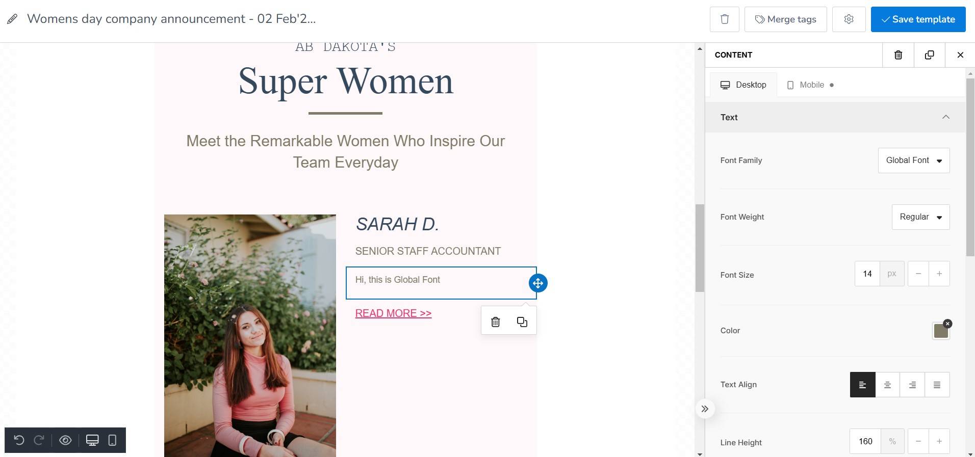
See the selected portion in this International Women’s Day email template from MailBluster. This email marketing platform has a Global font option for its clients. All marketers can send marketing emails using this font to their customers all over the world, ensuring that the email displays correctly on all devices in an easy-to-follow manner. Sign up and join MailBluster for such availability.
Wrap Up
Whenever an email lands in the recipient’s inbox, they’ll first see the email subject line and the preheader before opening it. But it is the font the reader will notice right after opening the email. If the font suitably matches your email content and brand, it will work in favor of a high engagement rate. Choose the best font for email wisely based on the knowledge you have gathered from this discussion. Email font is like the root of your email message; set this root right for a successful email marketing journey.
