Sending a welcome email is an essential part of email marketing strategy, and seeing some welcome email examples will help to do better. You must make the starting journey remarkable to grab your audiences’ attention and boost engagement. Indeed, welcome emails play a vital role in creating an excellent first impression. Therefore, you need to keep up with the best practices for sending a welcome email.
I have discussed the basics of welcome emails along with how and why to write them in my previous two blogs. And in this blog, I will evaluate some welcome email examples that set a great first impression. I will discuss them in detail; case studies of some of the remarkable welcome emails that will give you ideas on writing standard welcome email to new client or customer/subscriber.
Welcome Email Examples
According to the analysis on welcome emails, a welcome email , often known as an introductory email, can create a 196% lift in unique click rate. How you present the welcome email series tells a lot about you and your company’s values. And as you can see by the click rate of welcome emails, you need to ensure your audience is impressed enough by reading your welcome email to maintain a sustained engagement with them. Therefore, how you organize and write your email and maintain the welcome email flow is very important. So, I will introduce some impressive welcome emails that will help you make standard welcome emails in your email marketing journey.
Let’s go through some impressive welcome email examples then! Check these out!
Welcome email example from Eve Sleep
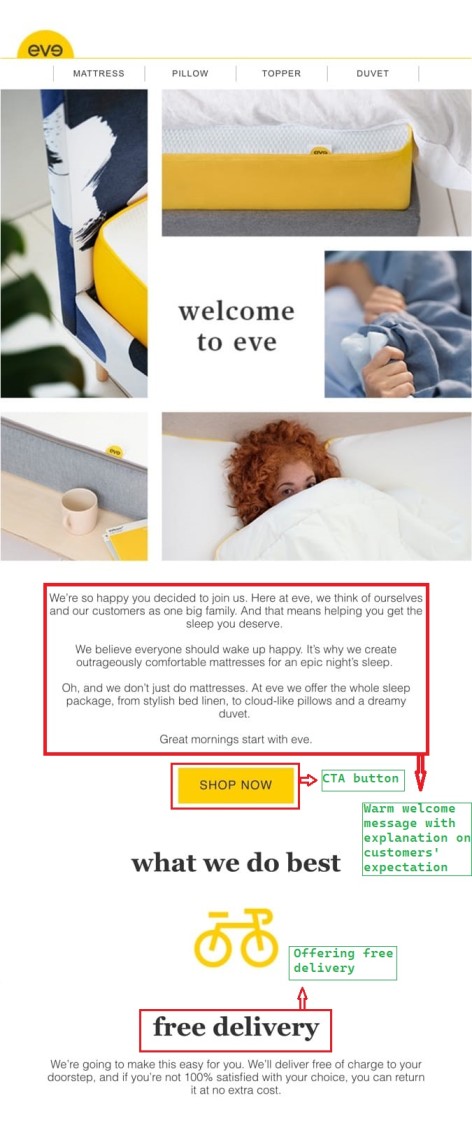
The following welcome email example is from Eve Sleep. They send this welcome email to new customer or client/subscriber. Though this looks very neat and simple, it’s very effective because it fulfills the basics of welcome emails. Eve Sleep is a sleeping item selling company, and within the email, they attached beautiful pictures of their products, such as pillows, mattresses, duvets, etc. The images they share in this one surely giveaway a scenario of how comfortable their products are.
Basic features
Check out this welcome email template! They’re welcoming, saying “welcome to eve” and beneath, it provides a warm welcome message and explains what the customer can expect from them. Then they provided a CTA button, “SHOP NOW” to take further action. And after that, they surprised their customer by providing a catchy offer of getting “Free delivery.” Check out the example; I have pointed out all these for your better understanding.
So it has covered
- Warm welcome message
- Displays beautiful pictures of their products
- Provides CTA button
- Provides a catchy offer
Welcome email from Supergoop!
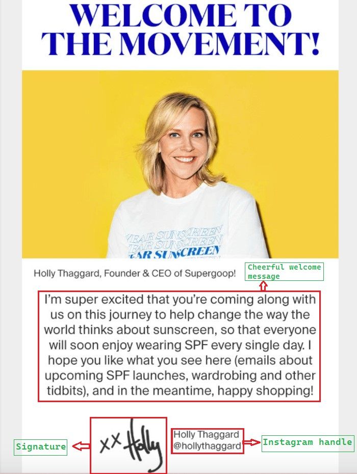
Supergoop! sells high-quality sunscreen, cosmetics, and skincare items. Its onboarding welcome email is a great example of approaching a new audience. Its CEO and founder Holly Thaggard is featured in a photo at the top, along with a cheerful welcome message.
Basic features
In this welcome message example, the CEO cheerfully greets and introduces new subscribers to the movement, expressing her delight at having them on board. And she gave them a general overview of what to anticipate in the Supergoop! newsletter. They will learn about new products, wardrobe advice, and other things. After that, Holly added a link to her Instagram account in her signature so readers could discover more about her. Instead of portraying Supergoop! as some faceless company, this welcome message has a really personal, friendly feel to it. Readers can immediately put a face to the name, which is a strategy that can be highly effective for increasing interaction.
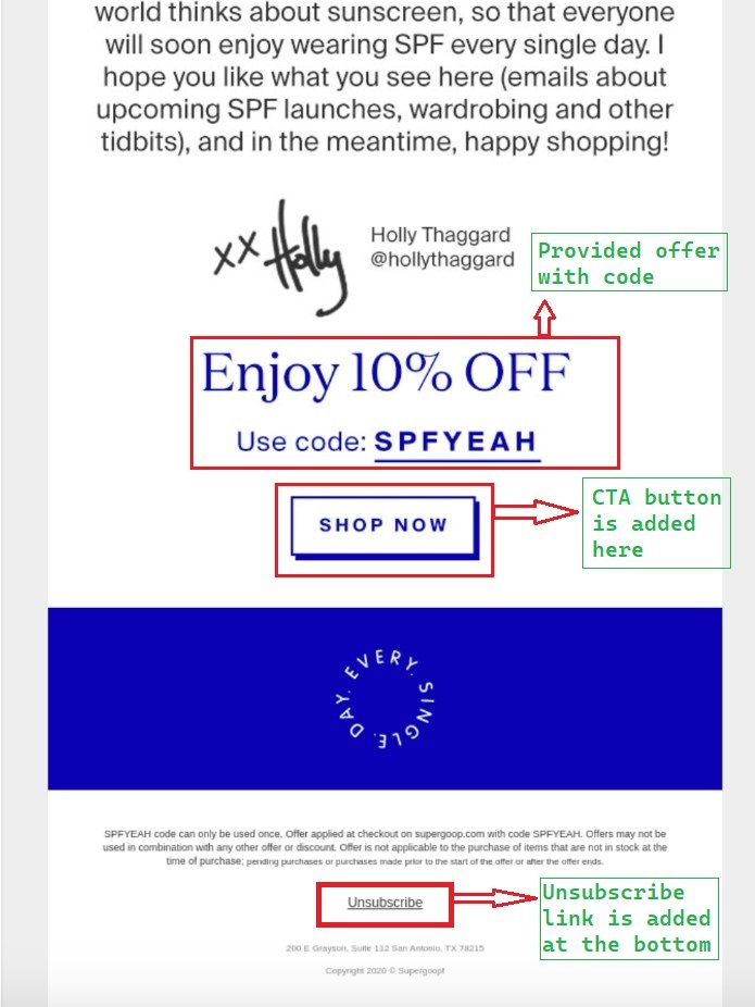
Finally, below that section, “Supergoop!” concluded the message by offering new readers a 10% discount with a code. Additionally, the brand makes its products easy to access by thoughtfully inserting a CTA that reads “Shop Now.” This welcome message does a fantastic job of conveying important information clearly and of establishing a positive relationship immediately. Needless to say, the discount code provided here encourages a significant portion of subscribers to go through it and make a purchase. Finally, they ended the welcome email by adding an unsubscribe link at the very bottom of the email. Including an unsubscribe link is essential because if the reader doesn’t want to receive emails, all they need to do is click that link. It benefits the sender, too, as it reduces email bounce rate.
So it has covered
- Picture of the CEO (sender)
- Cheerful welcome message
- Signature of the CEO (sender)
- Instagram (social media) handle
- Provides catchy offer
- CTA button
- Unsubscribe link
Example from InVision
InVision is a tool for designing, prototyping, collaboration, and workflow; the next welcome email example is from them. In this welcome email example, they welcome their new customer, Kasia, for signing up. Hence, it falls under the new subscriber welcome email category. Also, as it’s thanking the new subscriber for signing up, so it also falls under the “thank you” welcome email category. Also, the color they chose for it gives this welcome email template a neat and calm look.
Basic features
Check out the example; I pointed out all the elements that are present in this welcome email. It has a simple yet warm “thank you” welcome message followed by a CTA button “JUMP IN AND GET STARTED.” In the next part, they shared their popularity among renowned brands. So, it will tell about their quality and trustworthiness for being used by popular brands. After that, they gave short advice on having a better experience, and for better understanding, they included a video beneath it. Finally, they ended their welcome email by offering “GET STUDIO FREE.”
So it has covered
- “Thank you” welcome message.
- CTA button
- Cathay evidence of their popularity
- Advice on a better experience
- Attaches guideline video
- Provides offer
Example from The Body Shop
The Body Shop is a beauty care brand, and this company cares to fulfill its promise in its welcome email before providing more details. It also falls under the brand story welcome email category as it shared its brand story within the welcome message.
Basic features
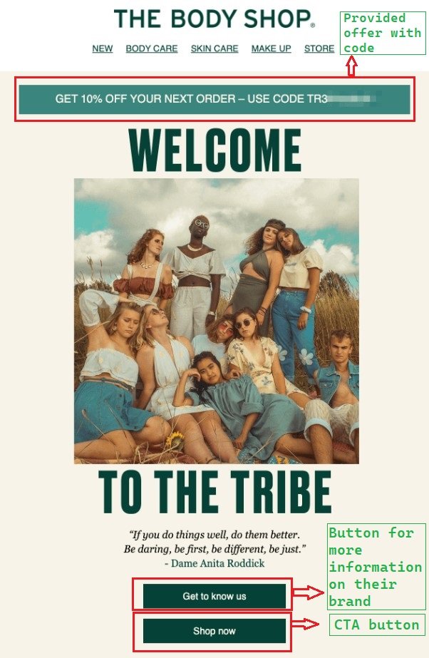
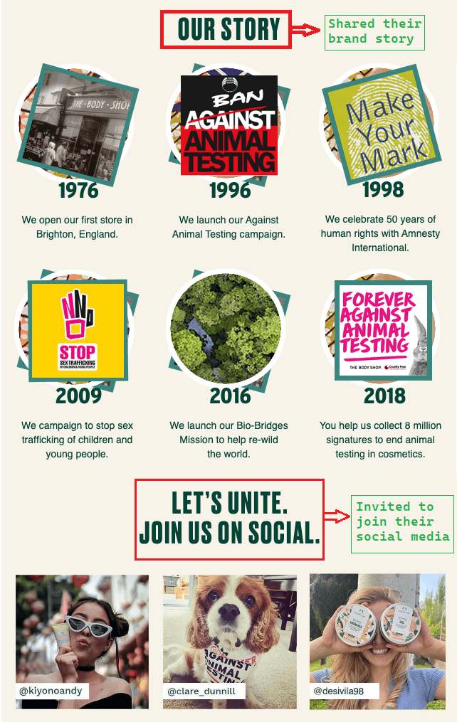
The brand welcomed new subscriber to the tribe after giving a discount code, which fosters a sense of community among its new users. The Body Shop then introduced its brand story with a quote that preferably fits the vibe. It provided an overview of the brand’s history and extended an invitation to engage in a sustained relationship.
As you can see, this particular welcome email hadn’t included a warm welcome message, which makes it different from the majority. Instead of providing a friendly welcome message, The Body Shop explained its value proposition within the framework of a brand story in this welcome email section. It doesn’t show how the business expanded to serve millions of clients, but rather how it helped to resolve environmental and social problems year after year, which is the subject of this narrative. And now that the user has signed up, they feel like a member of The Body Shop’s tribe and its cause. After that, they provided an option to learn more information about their brand, and then they included a CTA.
Plus, the way they shared their social media is unique too. For example, they started this section with “Let’s unite. Join us on social media” instead of a simple way like “Follow Us On Social Media,” thus portraying unity. In addition, the usage of customer images enhanced a community-like sense.
So it has covered
- Provides offer and code
- Includes option for more information on the brand
- Includes CTA button
- Shared brand story
- Provides invitation to join their social media
Welcome Email from Casper
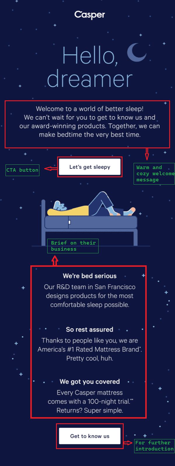
The following welcome email example from Casper surely gives both a warm and cozy vibe. Just look at the email’s decoration and how beautifully organized it is! Casper sells sleeping items like beds, mattresses, pillows, etc. The color used in the email portrays such a nightly, cozy vibe, and the welcome message shows a warm gesture! Even the addressing way “Hello, dreamer” perfectly matches with their business, and in the message, they welcome saying, “welcome to a world of better sleep!”. This tells that their products are of superb quality to ensure better periods of sleep for their customers.
Basic features
Check out the pointed sections in this welcome email example. Read the header and the message that welcomes the new customer; you will see I am right about matching the vibe. After that, they provided a CTA button, “Let’s get sleepy, ” urging the customer to take action by purchasing “sleeping” items. Next, it included three sections where firstly, they mentioned their comfortable quality. Secondly, they stated being America’s number 1 rated mattress brand and thanked the customer for their support. And thirdly, they mentioned their special trial offer, which works as a grabber.
So it has covered
- Warm and cozy welcome message
- CTA button
- Brief on their business
- option/button for further introduction to their business
Wrap up
Welcome email, indeed, is an essential part of email marketing. All you need is good knowledge and a compelling, effective price-friendly email marketing platform to send one! And our MailBluster is surely a suitable one for you to send welcome emails to your new clients and customers/subscribers. In this blog, I have thoroughly discussed some welcome email examples and highlighted the important sections for your better understanding. Hopefully, these welcome email examples and discussions will help you in enhancing your welcome email sending skills.







 Contents
