An email footer conveys the last impression of the overall email message to the receiver’s eye. But email marketers often pay less attention to this ending part because they focus on the email subject, body, and template design. Of course, those are essential, but the footer is undoubtedly quite important. Therefore, developing an attractive and powerful email footer with the required information must be emphasized. Also, it’s necessary if you want your promotional emails to convert more effectively.
What is an email footer?
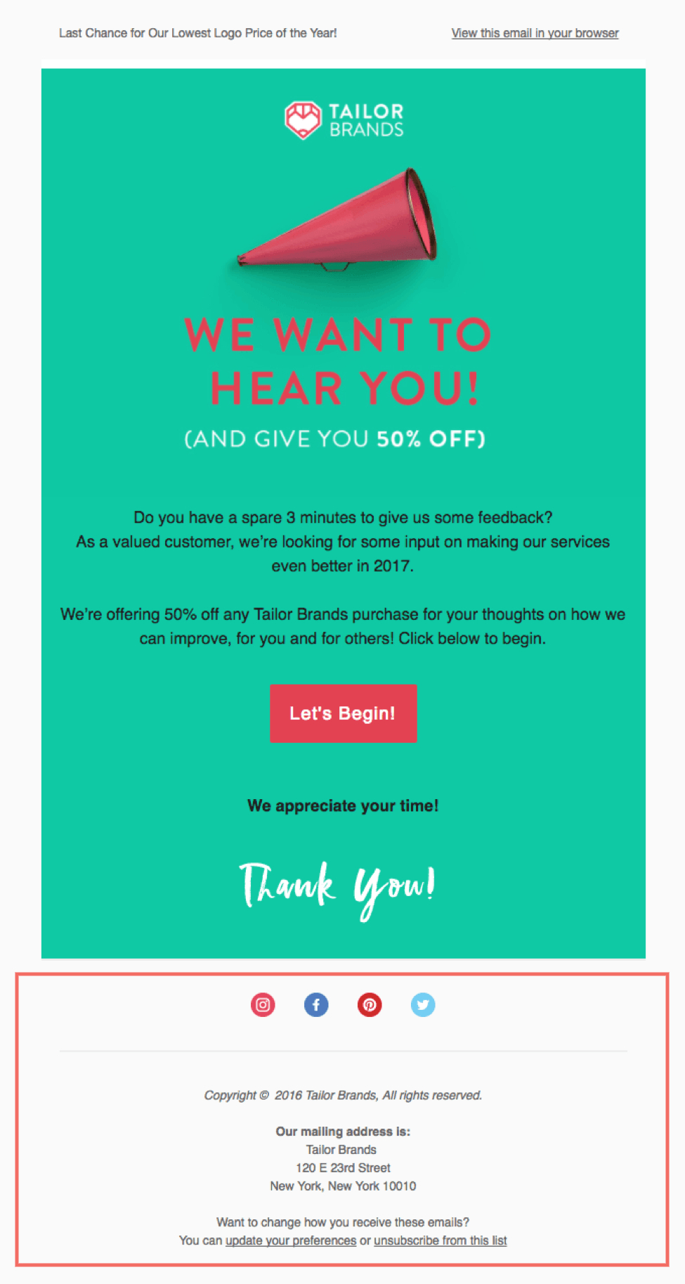
An email footer is the last section that comes after the email’s body content. For example, when a recipient receives an e-newsletter, the end part of the newsletter template will include the footer. The footer will be the final section of information that features essential data regarding the brand’s identity and details. Also, it contains many other helpful items, like a link to opt-out, contact information, social media links, legal disclaimers, etc. So, in summary, this last part will contain briefly highlighted information that the sender must include while emailing.
Difference between email footer and email signature
Many email marketing beginners mix these two parts, thinking both serve the same purpose. But unfortunately, they get confused about these two things, as both come at the end of an email campaign. So, let’s find out the significant distinctions between these two parts:
| Differences | Email Footer | Email Signature |
|---|---|---|
| Main objective | To represent information of an organization. | To represent information of a particular person. |
| Placement | It comes after the body of the email content, including the email signature. | It comes right before the email footer section. |
| Contains | Combination of text, logo, picture, visual design, etc. | Mostly text-based information, along with minimal pictures. |
| According to email marketing law | You must include some necessary elements in the footer section. | There is no hard and fast rule, but it is recommended for personal use. |
| E-signature | Not required. | Required, must be of the sender. |
| Social media icons demonstrate | Company’s social media page. | Person’s social media profile or page. |
| Opt-out option | An unsubscribe URL is required. | No need for an unsubscribe URL. |
| Legal information | Required – company’s terms & conditions and policies. | Not required. |
| Contact information | Required, must be of the company. | Required, must be of the sender. |
| Sender’s profile photo | It isn’t required because the company’s logo or name may be used instead. | Required, the sender’s profile picture. |
| Communication purpose | In terms of business and marketing communication. | Personal or internal communication. |
| Fundamental objective | To increase the business’s credibility. | To increase the sender’s authenticity. |
Is including an email footer legally required?
Almost all countries’ email marketing laws state that a marketing email campaign must include specific information in the email footer. Therefore, according to the most popular laws for email marketing, the CAN-SPAM Act (U.S.), GDPR (Europe), and ACMA (Australia), there is some mandatory information that needs to be in the email footer, like:
- The company’s physical address.
- The company’s contact details.
- An unsubscribe option for opt-out.
- Link to the terms and conditions.
- Link to the privacy policy.
Key elements of an email footer
Let’s elaborate on all the legal requirements you must include in the email footer. In fact, these elements will make your marketing approach legally safe and ensure adequate customer responses.
Unsubscribe link
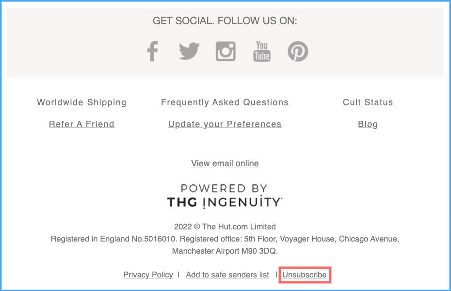
Indeed, no company wants to lose any of its subscribers, as building a user base takes time and effort. But you have to respect the choices of your subscribers. If your subscribers want to opt-out of your email newsletters, you must allow them. Remember, you can not market your campaign forcefully; it increases spam complaints against you. Moreover, all the email marketing laws strongly recommend using an unsubscribe link in email campaigns. So, including an unsubscribe link in the footer is essential, and it should be visible so the recipient can find it easily.
Pro tip: You can significantly reduce the unsubscribe rate if you avoid buying any email list and consider using the double opt-in method while generating new leads organically.
Social media buttons
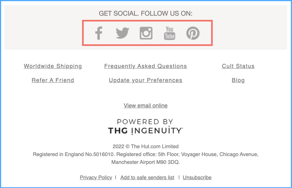
Nowadays, social media platforms are the most popular and effective communication mediums, with over 5 billion active users worldwide. Therefore, every brand should highlight its social media pages in its email campaign. An email footer is the perfect place for appropriately placing social media buttons. Adding all your social media links in the footer will increase customer engagement. Remember, people usually visit the company’s social media pages to check reviews before purchasing a product or service. Likewise, your email recipients will be eager to find more information on your company’s social media pages before taking action. Besides, many people prefer to connect with social media messages instead of sending emails, as it is the fastest communication method. Therefore, every company should put all its social media buttons in the footer section and actively manage the pages.
Provide legal information
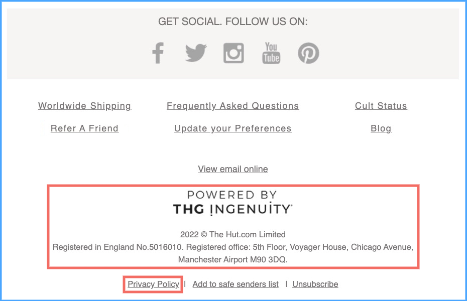
As mentioned earlier, according to email marketing laws, a company must include certain legal information in the email footer section to stay on the right side. Following this required legal information enables a company to gain higher customer trust. For example, a company’s visible policies, physical location address, and contact details will create strong faith in the brand. Also, here is more information that you should include as legal disclaimers in your footer:
- Company branding
- Contact information
- Physical store location
- Privacy policy
- Terms and conditions
- Company registration number
- Registered office address
- Copyright
CTA button
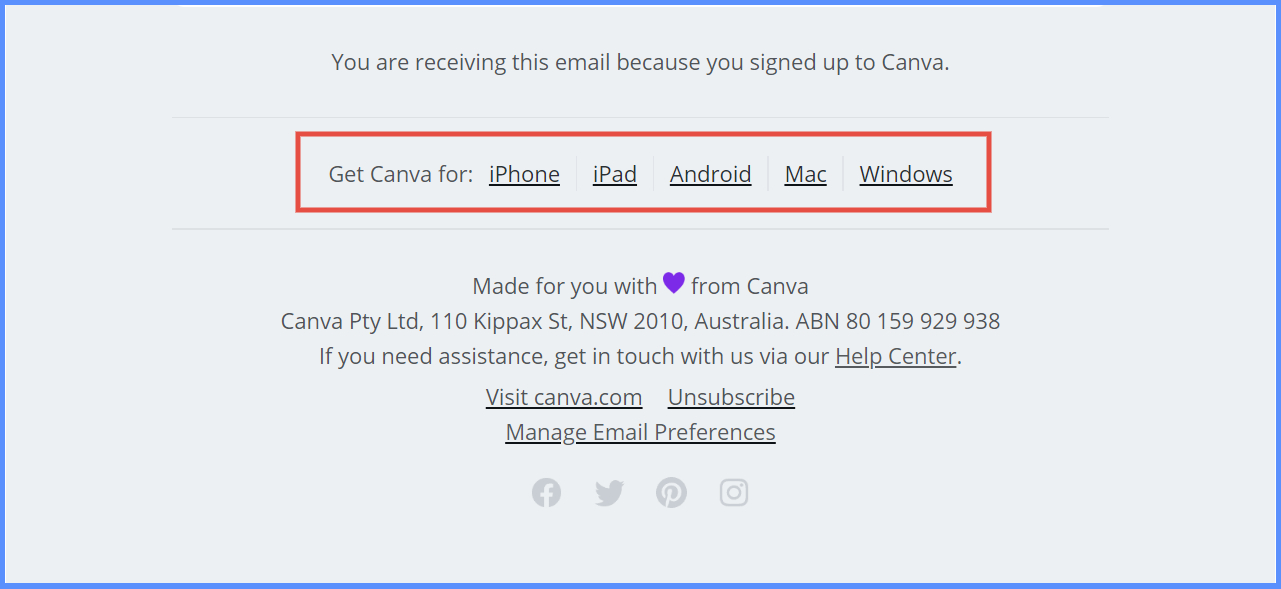
A call-to-action (CTA) button in the email footer is optional if you have already added it to another part of your email. But for some businesses, considering it is a wise decision. For example, if you are a SaaS company, you should add shortcut CTA buttons in your email footer, such as a download link, a subscribe link, a blog link, an FAQ link, etc. Because when email recipients read the entire newsletter and decide to take action, they can use the one-click CTA button. In addition, the CTA button can help new subscribers purchase the plan or service quickly after checking out the newsletter.
Email Footer best practices
You already know about the essential elements of an email footer section. But to make this closing section more effective, definitely consider these three tips:
1Include social proof
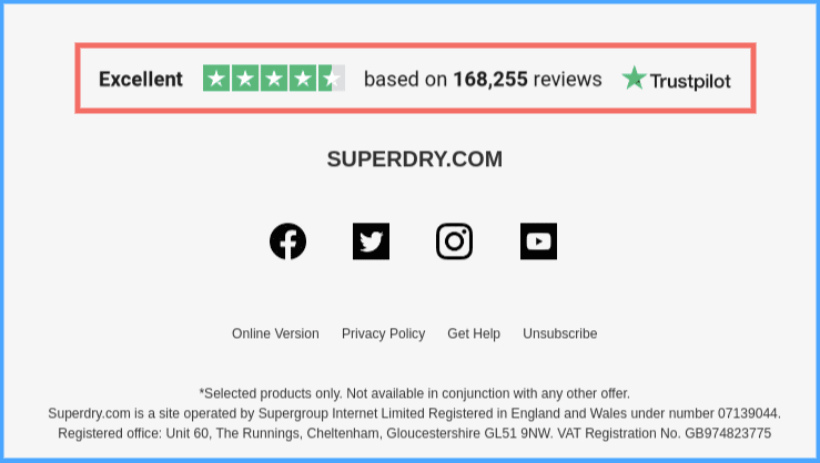
Social proof is a powerful marketing strategy in the current era. When people purchase something, they consider reviews of others, recommendations, and achievements, which is what “social proof” demonstrates. A recent study showed that 93% of customers check online reviews before purchasing. In addition, nearly 61 % of online buyers in the United States always consider online reviews before buying. Therefore, it is best practice for any company to highlight its achievements or positive reviews in the email footer section.
2A safelist request
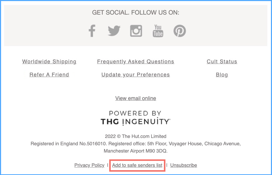
Most often, email marketers avoid this strategy of adding a safelist request to their email footer. But including it in the footer will help them from not being blacklisted. The “safelist request” means asking your email recipients to add your marketing email address to their address book. So that they (the email recipients) will willingly approve your marketing emails, and your email will deliver to their inbox without facing any obstruction from spam filters. Overall, this strategy helps email marketers ensure an excellent email delivery rate.
Pro tip: Always avoid using a “noreply email address”. Asking the email receivers to add this email address to their safelist is inappropriate. Because almost every popular ESPs will disallow safe listing of any “noreply email address.”
3Make your email footer mobile-friendly
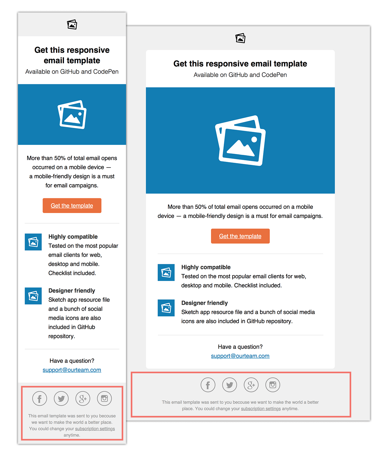
With smartphones’ popularity, people frequently check email on their mobile devices. 99Firms’ mobile email statistics say that 85% of people use smartphones to view emails. So, you have to make your email footer mobile-friendly. That means the footer’s elements should be large enough for the email viewer to interact easily. For example, Google recommends at least a 48×48 dp touch target for a touch screen object or icon, and Apple recommends a 44×44 dp touch target. In this case, if you use MailBluster for bulk email marketing, you can forget to maintain these “touch target” recommendations. Because our email marketing tool automatically adjusts your email footer design to be mobile- and desktop-friendly.
How to design an email footer by MailBluster
MailBluster offers an easy drag-and-drop editor to create your email footer effortlessly. You will find many features on the editor’s dashboard (right side), such as adding a button, heading, image, text, video, etc. You can drag and drop any elements from there to design your footer.
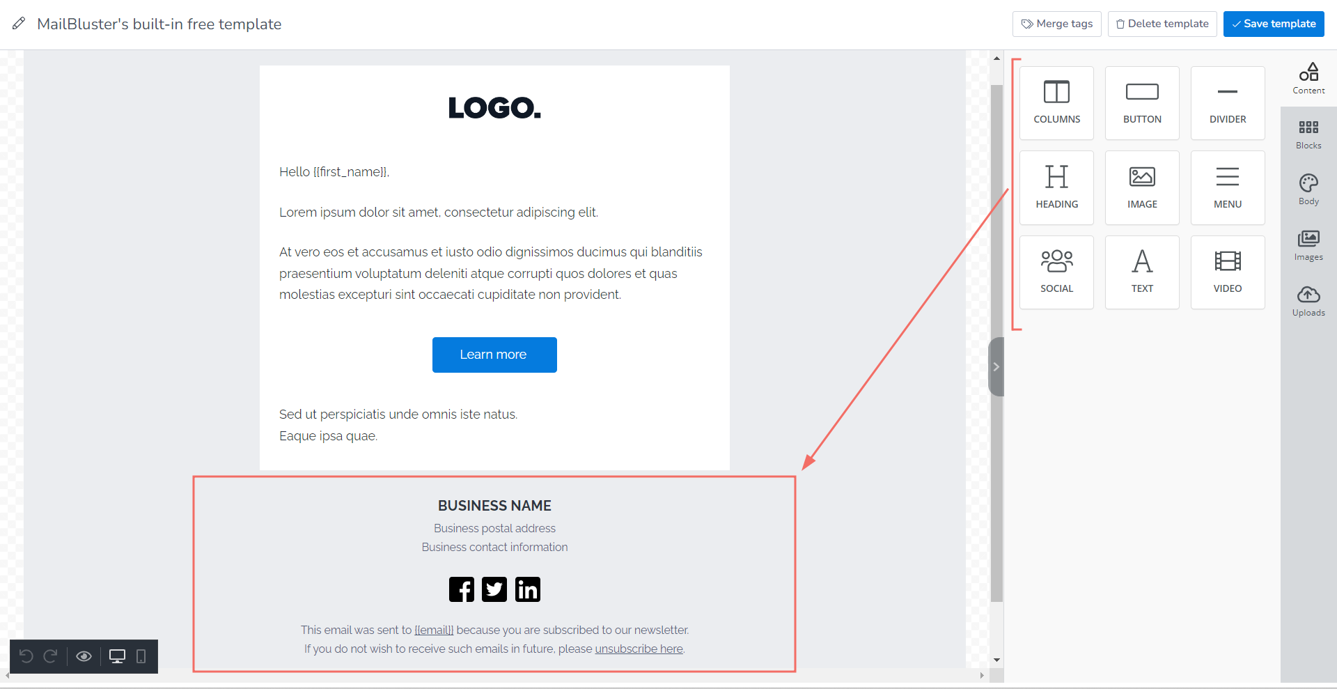
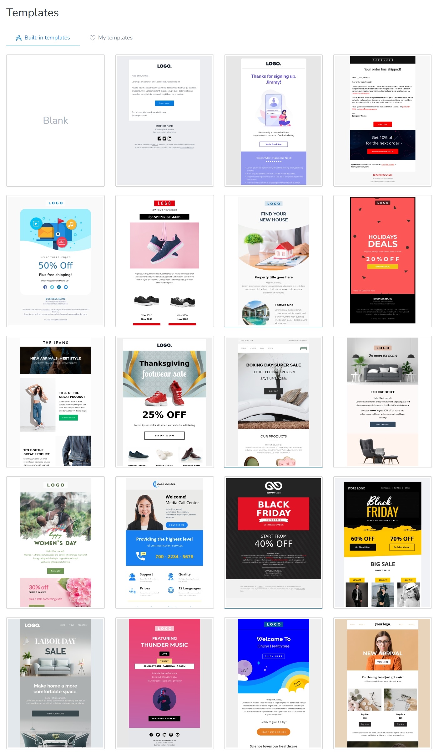
Along with the drag-and-drop editor, MailBluster also has a lot of built-in free email templates. These free designs will enable you to build your email’s footer section more easily and artistically.
Take Away
Indeed, the email footer is a significant section, just like the email header and other parts of an email. It establishes your credibility with your target customer and tells your email recipients how detail-oriented you are. As a result, email footers can significantly improve your email marketing communication. It is the last thing visible to every email reader, which can make a strong final impression. If the last impression is eye-catching, it can immensely increase your conversion rate.


 Contents
